I am deep in the creation of a lesson for my IGNITE! Membership group on the benefits of doing thumbnails. As you know, I am a HUGE advocate for doing thumbnails so I thought it a perfect opportunity to share my thoughts on thumbnails and show you some examples alongside my pastel paintings as well as a version of the paintings in black and white so you can compare them to the thumbnails.
The main reasons I think thumbnails are so beneficial are:
- They help you become familiar with your subject before you get into painting
- Thumbnails are small and quick and so they afford you the opportunity to be creative, to try out things you may not otherwise explore
- Value choices can be explored and decided on
- You can play with formats
- Your painting can be fully composed before putting a stroke of pastel down
- You can pay attention to your ‘why’ when you get to the painting.
Basically the benefits of thumbnails are that you will have a stronger painting and more successful painting. The time and effort are worth it!
Let’s have a look at some of my pastel paintings that have appeared in earlier blog posts (usually as a step-by-step progression).
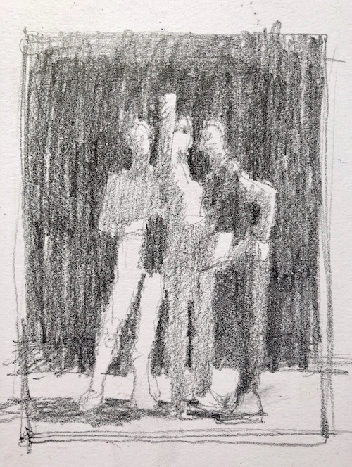
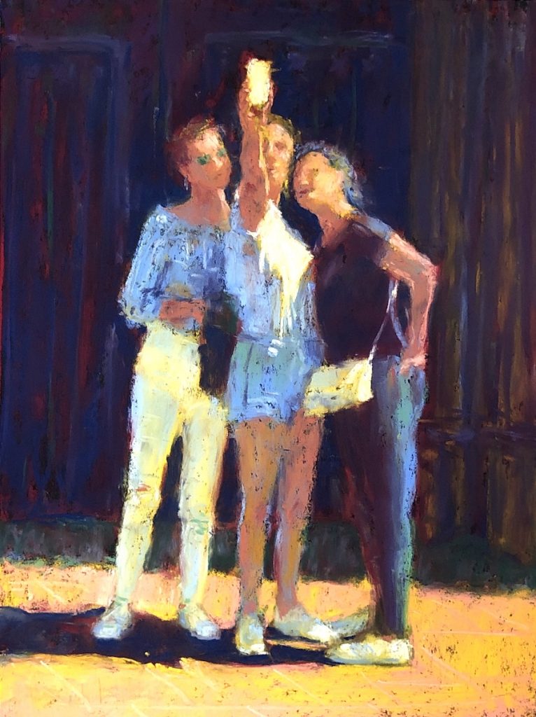
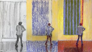
You can see below how closely I stuck to the original pencil thumbnail in We Three.

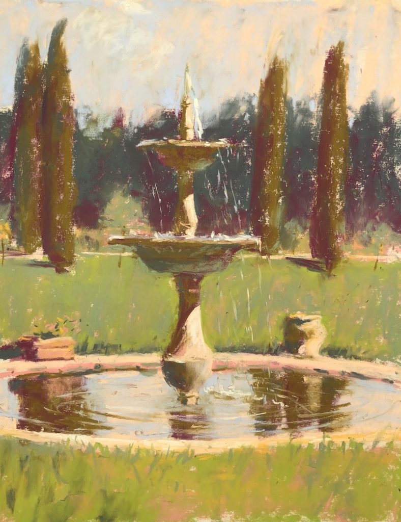
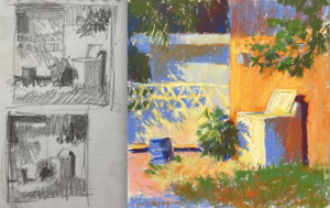
Now have a look at this piece – Fountain at Villa Nobile – that I did en plein air. This time I used a pen (which was a bit dry!). You can see how I made a really tiny second version (bottom left of the thumbnail image) which clarified where my three value choices were placed.


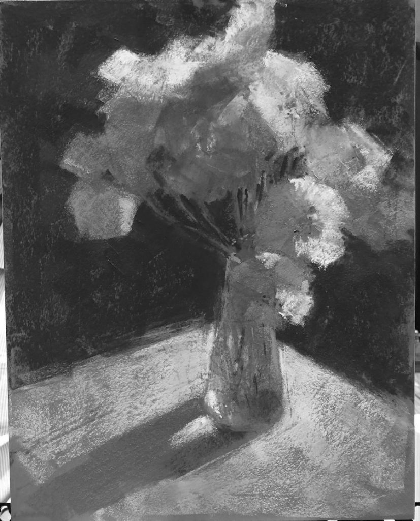
Let’s go on to Iceland Poppies, a floral demo experiment done at IAPS 2019 from a photo on my iphone. Again, the thumbnail is quickly sketched in pen and ink.

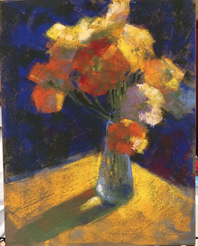
The next was a small colour study, Snow Day, that I painted to show how to use colour under white to ‘push the colour’ in white. Even though this is a very light scene, it still has darks, middle, and light values within its lighter context. Can you see the only darks in the picture? They are the tree trunks and the line indicating a ditch or something running horizontally across the piece in the background.
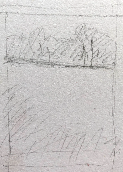


Now let’s look at this painting, Twilight, from one of the 31-pastels-in-31-days challenges. You can see two thumbnails here (and there were actually three but they all wouldn’t fit!) where I am trying out different value compositions. I think it’s pretty obvious which thumbnail I picked….


Here was a very quick pastel I did en plein air in Mexico. Even so, I made sure I did a thumbnail first to help me know where I was going. (Total time for thumbnail and painting was less than 20 mins.) As I worked, more light appeared in the foreground and I decided to change the painting, The Turquoise Wall, slightly from the thumbnail. This is something I rarely do!
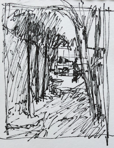


And finally there’s grumpy old me! Even with this non-realistic piece, I started with a thumbnail!
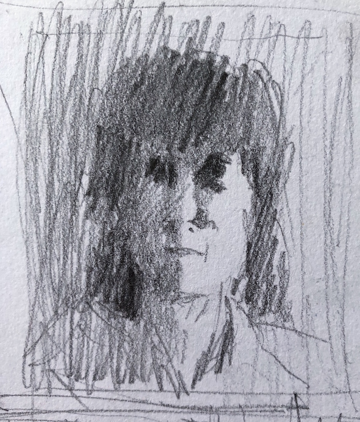

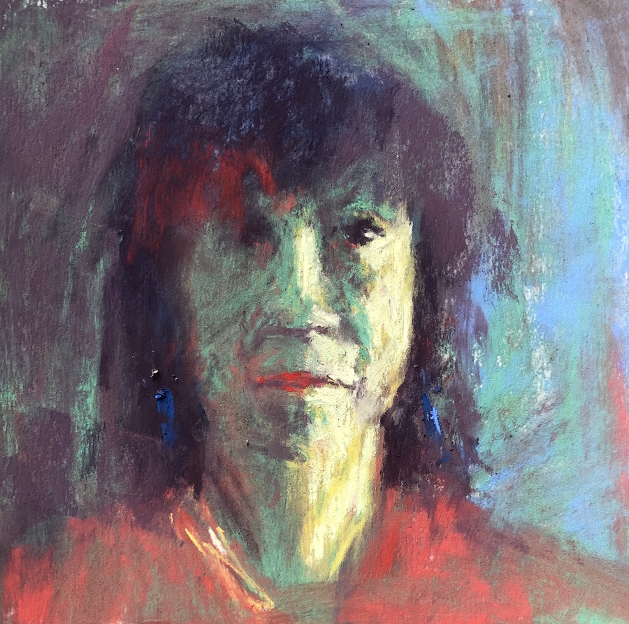
I hope you can see, from these examples, the benefits of doing thumbnails. Thumbnails give me a road map to work from. They allow me freedom to play around with colour and expression when I get to the painting part. All the hard work is done beforehand!
I’d love to know what you think. Do you see the benefits of doing thumbnails? Do you make thumbnails on a regular basis? Or if not, do you sometimes do them? I hope if you don’t do them at all (go on, fess up!) that you’ll take them to heart now!
Until next time 🙂
~ Gail
PS. The feature image for this post shows the thumbnail along with the black and white and colour versions of “View From Calella,” Sennelier pastels on UART 320, 9 x 12 in. Click here to see the original post.










34 thoughts on “The Benefits Of Doing Thumbnails!”
Let’s just say I’m doing more thumbnails. Other folks need motivation to do a thumbnail? Honestly, good pastels are too expensive to waste on a painting that is not well considered— that’s what motivated me!
Nancy I LOVE your motivation for doing thumbnails!! Thanks for sharing it 😀
I think I’m going to try out thumbnails. I do tend to change my mind at times trying to arrange a drawing and end up erasing a lot.
Ahhhh yes. In the thumbnail, you’re trying to do all the ‘heavy lifting’ before you get into your actual piece. They are small and once you have a strong design, it’s worth sticking to it!!
Thumbnails? too small! I guess I’m a 8 x 10 sketch artist; but I do admire those who, like you, can work from such. Good stuff.
Nothing wrong with a good sketch Cliff!
One of these days though, maybe I can get you to come round to thumbnails… hah hah 😀
I used to always omit thumbnails because I wanted to PAINT! However, after years of ignoring the good advice in the Pastel Journal, I tried one for a large snow scene with a wintry road going back into some trees. When I did my thumbnail, I was copying my photo and, noticed the road centered in the bottom of the scene. Hmmm. Centered. Not good. So I altered it to the left and made a prizewinning picture in a local competition. So, I have been an advocate ever since. Now, I use various cardboard formats (3 x 4, 2 x 4, 3 x 3, etc.) to quickly tryout various formats. How do you do your black and white versions? Are they an underpainting for your pastels, or a separate study prior to color?
Marilee LOVE your conversion story!!! I hear the “But I just want to get to the painting part” as an excuse for not doing thumbnails. Your experience is a fantastic one and I so appreciate you sharing it!
I’m sorry I wasn’t clear…the black and white images are desaturated photos of the colour version. I wanted to show the painting in black and white so as to compare more easily how the end painting lined up with what I designed in the thumbnail. Make sense?
I was not taught to do thumb nails. I sketch a rough outline on my 9×12 paper in charcoal which is easy to erase. I usually draw lines on my original picture (dividing the pictures into 1/3rds both horizontally and vertically on both the original picture and my drawing paper). That helps me keep my perspective in my drawing.
Thanks Judy for sharing your method.
I wasn’t taught to do thumbnails either. I’d heard about them but couldn’t be bothered. But after taking a workshop with Doug Dawson and then a couple years later with Sally Strand, I was convinced and took them on whole heartedly for all the benefits they bring!!
Hi Gail,
Thank you for this. I occasionally do thumbnail. I’m trying to be better about it.
After seeing this, though, I realize I was trying to be too perfect in my sketching which I found discouraging and a waste of time. Now, I’m going to re-think it.
Thank you, again,
Sasha
Aha Sasha. YES! They are quick notations for your purpose, to guide you in your painting time. When I teach, I encourage the use of thick markers so there is no question what is dark, what is middle, and what is light value. The thing is to make very clear choices and state them in your thumbnail. My examples here are not the best for others but they are very clear maps from which I can work.
Do those thumbnails!
I would have liked to read the article, but on my iPad, all the pictures were pasted on top of the script. I can see the script running between the photos.
Argh that’s so frustrating John!! Funny because everything shows up well on my iPhone… Do you have another device (laptop or desktop) where you can see the blog post?
I use Thumbnail sketches a lot in my work. Especially when I do commissioned work. It helps me compose the figures and also gives my clients an idea of how their piece will turn out. I also utilize them when planning my studio and plein aire work! They are invaluable!!
Whoo hoo!! Thanks so much Marlene for being a thumbnail proponent and sharing why!! I love that you can also use them to show clients as a way to give them a heads up about what’s coming.
Thanks, Gail. This renewed my resolve to do thumbnails (notans as I first learned) in everything, not just plein air. Also, everything does not have to be a finished painting. Experiments are so valuable.
Harriett Masterson
So great to hear Harriett! And yes, experiments are valuable and where amazing unexpected things can happen.
By the way, thumbnails can be done as Notans which are only made from two values – black and white. Richard McKinley creates Notans from his four-value thumbnails, taking the two darker values and making them black while taking the two lighter values and putting them together in the white. Check my blog post on my experience in my workshop here
I’m still a three-value thumbnail gal however!
I do…. and so remember the view we shared in Spain…a totally awesome experience, with such an inspiring instructor..
Hey Sue, I remember it too. What a marvellous time we all had 😀
Hi Gail,
I noticed that in the last blog entries the pictures overlap te text. Is that intentional? I hope it is not my computer doing that (?).
I always enjoy your posts and find them helpful and inspiring. Thank you,
Pilar
Hi Pilar,
Definitely not done intentionally! John (above) was running into a similar problem on his iPad. I have noooo idea why that’s happening… Hoping you have another device to try.
Technology…!
I think you finally succeeded in getting me into the habit of making thumbnails. It is always my starting point now. It really does help in preparing for the actual painting. Thanks bunches!!
I am definitely doing a happy dance Ruth!!!
Very clear explanation (and examples) of the value of thumbnails. Thanks, Gail. I don’t do them enough but when I force myself to slow down and complete them they are a huge resource. What size do you use? I haven’t learned to create / benefit from the really small (under 2″ on a side) versions. I think the (huge) inherent benefit from creating thumbnails is the THOUGHT process that they force me to go through.
Thanks so much Tom!!
Mine tend to be between 1 1/2 to 3 inches. Anything larger takes too dang long!
And you said it, one of the benefits of doing thumbnails is slowing down and beginning to understand and become familiar with the subject and how best to portray it.
Gail, thank you so much for this blog on thumbnails. I’m beginning to use them more and find them helpful with my painting. I’m hoping to feel more comfortable with actually doing Plein Air, usually I paint from photos.
Thank you also for the link to Nancy Nowak, and her link to youtube mounting pastel paper onto foam core. I may try it. Glad to have joined Ignite Membership.
So good to hear you are using thumbnails more often Kathy! We will make you into a Thumbnail Fiend yet Hah hah. And thank you so much for being a founding member of IGNITE!
As to Nancy Nowak’s video, I believe that was someone else in the IGNITE! community. Fantastic resource though so for anyone wanting to learn how to mount UART paper, click here!
you have convinced me, my son, who is a professional painter has been telling me to do thumbnail sketches for years, you have brought it home to me. a million thanks
Whoo hoo Clarissa!! I’m soooo glad to hear that (as I am sure will your son!). Now go do some thumbnails and then follow what you’ve created as you go through the painting process.
It seems like a three fold process. As a color blind artist, I would make a thumbnail with a marker, make a black & white drawing (I seem to draw fairly well), photocopy (not redraw), and paint over (with my own color scheme) the B&W photocopy. Does this make any sense. It just seems to take the pressure off to produce the “right” colors.
Hi Joe, thank for your comment and question…I think my answer to you would be, if you draw pretty well then why not take your thumbnail and then draw it up on paper and go directly to your colour scheme (rather than the whole photocopy palavah). I’m always encouraging away-from-reality colour schemes so if you can stick with the VALUE pattern and can see the colours in values, then experiment away!!
(If I haven’t “got” what you’re saying, please let me know!
Hi Gail,
ooopsie…. I usually do a few thumbnails and colour swatches and study, but the last few paintings I’ve done I have just jumped right in. The current one I have started with a rough sketch and although there are problems not yet solved I was tempted to just start the painting.
I am so glad I read this before developing a bad habit. The time taken to plan a painting is precious and it is part of the process. It is tempting to get paint on the canvas to appear productive., but the reward for planning will be visible at the end.
You got it Melanie!!
And so glad to hear that you do create thumbnails and swatches and plan a bit before jumping in right away. Colour, mark-making, and just getting into the good stuff, they all call loudly don’t they?!