Ohhhhh you are in for an unusual treat today. Meet Michele Noiset!
One day, I was cruising through the Dakota Arts competition winners, and boom! I was stopped in my tracks by a most unusual and gorgeous piece. The art was by Michele Noiset and I knew there and then that I just had to have her on the HowToPastel blog!
So I reached out and happily, Michele Noiset said YES!
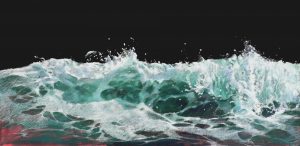
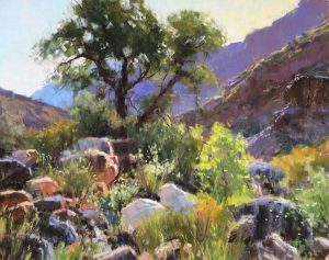
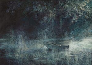
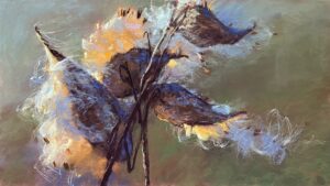
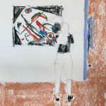
Here’s a taste of what’s to come!

Before I hand over the blog to Michele, here’s a wee bit about her.
Michele Noiset Bio
Michele Noiset’s illustrations have graced everything from children’s games and puzzles to rugs, books, greeting cards, ornaments, and snowboards. She graduated from the Rhode Island School of Design with a major in illustration and has been drawing ever since. After freelancing in Boston for many years, Michele returned to school to earn her MFA at the University of Massachusetts and then moved south in 2013 to pursue her academic career. She headed the illustration department at the Memphis College of Art until its closing in 2020 and recently joined the faculty at the University of Arkansas/Little Rock as Assistant Professor of Illustration. She continues to freelance and create art for her personal collections. You can see more of her work on her website.
And now, here’s Michele Noiset to take you on her journey!
~~~~
My first introduction to pastels was as an undergraduate student at the Rhode Island School of Design (RISD) where I received my BFA in Illustration. I had a wonderful teacher, Akira Arita, who created very evocative pastel drawings. When drawing a series of white teacups for an assignment, trying hard to make them luminous and bright, I layered more and more white pastels. “Don’t add more white, add contrast,” Akira said. His simple words were quite revelatory. It’s funny how you remember specific advice like that for a lifetime. I also had a classmate whose pastels inspired me with their energy and spontaneity. To this day, I think of her pastels as some of the most luscious, vibrant, and energetic I’ve ever seen.
My grandfather was the main influence on my direction in art. As a German prisoner of war for four years during WWI, he taught himself to draw. He retained his love of drawing throughout his life.

As a child, I became his willing pupil. He would bring me Walter Foster drawing books and supplies each time he visited. He drew by example and I would repeat his lessons. I attribute my love of drawing to him. I still have the original wooden box set of Rembrandt pastels I inherited from him when he died. It’s been replenished many times over.
My career as an illustrator has been as varied as the profession itself. It began with pastels but incorporated many other mediums as well. I have worked in editorial, advertising, children’s publishing, and surface illustration for use on home goods and giftware. My background has taught me that the work of an illustrator is constantly evolving.
Since my undergraduate days, I loved drawing in pastels because of the medium’s immediacy and spontaneity, but the fragility of pastels kept me from using them in my printed work. The advent of the computer as a tool for scanning and sending artwork in the 1990s was a welcome development. Original drawings no longer had to be shipped since sending images electronically through digital files became possible. My illustrations could be drawn at a large scale, photographed, and then digitized on the computer. Pastels became the exclusive medium of choice for my work.


I enjoyed the many avenues that Illustration took me, but found myself wanting much more meaning in my work. My desire to pursue a Master’s degree soon became pressing. Enrolling at the University of Massachusetts, I yearned to find a new impetus to create. I wanted to resist old patterns and comfortable resolutions in my art. I began working with abstract themes and looking at authors whose writings were driven more by concept than by narrative.
This graduate-level exploration began with the play Rhinoceros by Eugene Ionesco. Ionesco’s narrative underlines the ideas of conformity and the power of contagion. It depicts the struggle of one man to maintain his identity while the rest of the world succumbs to popular thought. Rhinoceros belongs to the school of drama known as ‘The Theatre of the Absurd.’ Ionesco combines philosophical ideas along with concrete humour in this popular play. The characters in the play transform one by one, into rhinoceros, an absurd idea in itself, illustrating, quite effectively, how the current of popular opinion can become an acceptable norm.

Depicting the evils of man seemed like a topic rich with visual possibilities. I was drawn to dystopian novels written as a criticism of political and social institutions, especially because they characterize specific evils of human nature that I strove to convey. They helped outline and delineate my thoughts. Current topics in the news and the media, after all, are most often recurring events dealt with throughout history in varying guises.

I chose texts that have been written about extensively. The concepts they lend as illustratable are complex and embody recurring themes in our contemporary media and the human condition in general. Instead of trying to depict, in a narrative fashion, the characters of the stories and the events that transpire, I chose to represent the concepts and abstract moods therein as concise visual metaphors. All of the texts that I chose to illustrate explore problems and questions universal to the human experience and deal with the dark side of our nature. The genre of novels known as Dystopian (stories about perfect worlds gone wrong) constructs a strong framework for the review of man’s weaknesses and imperfections.

The series of pastels that I began during my graduate studies brought my work to a new level. I’ve always enjoyed working more directly in pastels, creating quick studies from still life. The approach that I began while earning my MFA required many more steps. The results were not as immediate as referencing something such as a still life in front of me. Developing a nuanced image meant lots of hours of preparatory work.
After earning my MFA, I continued my exploration of contextualizing dystopia. I used texts to inspire some pieces and broader themes such as censorship to drive others. I find myself often returning to the themes of classic novels. Novels such as The Road, Lord of the Flies, 1984, The Giver, and The Handmaid’s Tale are some of the stories that I have worked with.

My MFA also brought my career into a different realm as I began teaching full-time, first at the University of Massachusetts/Dartmouth where I received my Master’s. I moved to Memphis to head the Illustration department at the Memphis College of Art. When that school closed permanently, I landed at the University of Arkansas/Little Rock where I currently teach illustration.

Most recently I have been working on a very different series inspired by a friend’s exploration of “lost spaces”, places that humans have developed and then later abandoned. Fascinated by shapes as well as the new personalities that these man-made constructs inhabited, I began working on more abstract images.
The Maunsell forts built in the Thames Estuary to protect the United Kingdom from German vessels are structures that I return to repeatedly. I find them eerie but beautiful and am fascinated by their transformations in time. Based on these structures as well as other abandoned spaces that have been given new life such as GasWorks Park in Seattle, I have been developing a collection based on this theme.


MY PROCESS
To develop ideas for my drawings no matter the approach to my subject, I generate many thumbnails. These are small 2 x 3-inch pencil drawings exploring shape, composition, value, and meaning. I work traditionally using a mechanical pencil and 2B leads on tracing paper, or I use an iPad and generate thumbnails in the Procreate app.

I also create many wordlists. Words can help generate thoughts and provoke my imagination sometimes more quickly than drawing. I list words in different categories such as themes, colours, objects, and settings. I go back and forth between words and thumbnailing, trying to establish connections.
Sometimes my ideas come very easily and I discover something that intrigues me quickly. Other times, I generate hundreds of thumbnails and the solution eludes me. My favourite part of my process is this sketch stage because the options are limitless, and possibilities abound. I can thumbnail forever and come up with more and more approaches. Deadlines are always helpful in forcing me to choose a direction.


After I have identified a thumbnail that feels like it resolves or answers the questions I am looking to answer, I often scan it and print it out at a larger scale. This helps work out the formal elements of the image, such as the composition and the details. This stage can take time if I don’t have a clear idea of exactly how an image will hold together. If my thumbnail is very rough, refining it to an acceptable level can take reworking and reworking it. I feel that the process is very much the way a writer works, creating a rough draft and then editing and editing it to take out extraneous detail and leaving only what supports the concept.

Working out my palette using Procreate for my more extensive drawings is a great approach that has saved me a lot of time. I take my finished sketch and draw over it digitally. I’m able to experiment with many different directions in very little time. In the past, I printed out my finished sketches and used coloured pencils to experiment with different colour concepts.


Once my pencil drawing is exactly what I want, I am ready to transfer my idea to paper.
I use many different supports for my pastel work, depending on the goal of the end piece and what it will be used for. My favourite support is Canson Mi-Teintes paper. I most often use Felt Grey or Tobacco colours. The Felt Grey is a wonderful tone for cool colours and the Tobacco Brown colour works well with warm colours and can also offer great contrast for cool blues and greens. Most art supply stores sell 19 x 25 in Canson Mi-Teintes sheets. Those are great for studies and smaller works. Purchasing a large roll is ideal for bigger works.


The other medium that I find invaluable, as a support in working with pastels, is Art Spectrum Colourfix Primer. I purchase it in small containers of Rose or Elephant Gray. I prime large sheets of BFK Rives or Stonehenge, sturdy papers that can take a lot of layers and reworking.


First I measure out my image size and tape off the borders so that the edges stay clean. Usually, two layers of the primer will suffice. The paper often buckles with the wet primer applied. Using two large sheets of ½ thick foam core board to sandwich the paper and weighting it with books or weights will flatten the surface perfectly. I sometimes leave the paper weighted in between the foam core for several days to ensure that it’s flat. I leave the paper attached to the foamcore because it offers a strong backing while working on my drawing.
I’ve enjoyed working on UART paper most recently. This sanded pastel paper just soaks up the pastel chalk. It is a wonderful surface to layer extensively.


I use many different types of pastels and have experimented with many various brands. I often block out my drawings with NuPastel first. NuPastel is one of the harder sticks. I can apply them quickly by colour blocking to determine my palette and focus. After the layer of NuPastel, I will work primarily with a medium-grade stick such as Rembrandt.
Rembrandts were the first pastels I used and I find myself returning to them often. Because they are harder, they are easier to control.
Sennelier and Terry Ludwig are the softer pastels that offer bright punches of colour and thick application. Going back and forth, I add layers, wipe out areas, reapply, and layer until I am happy with the texture and application. Using Krylon Workable Fixative in between layers allows for more applications and will allow the drawing to be knocked back in order to pull up the main areas of focus.

One thing that I use while working that is so helpful is a tiny 5-hp shop vac. I keep it beside my desk as I draw and when my paper is completely covered with a thick layer of pastel, I use the shop vac to vacuum it all up. I keep a mask on and keep the vacuum hose a couple of inches from my drawing surface so that I don’t disturb the drawing too much. In the past, I used a much more powerful shop vac. When I wasn’t careful, the vacuum would take the paper right up and I would be left with a big circle the size of the vacuum hose on my drawing. A 5-hp vacuum works perfectly and keeps me from having to run outside to tamp the back of my drawing constantly. Ventilation is important of course.
Outside of my personal practice, I enjoy working on small studies or exercises. It’s a fun way to experiment and to create without doing prep work as I do on my more intensive pieces.
I especially love drawing animal skulls, something that I have loved since drawing in the amazing Nature Lab, a wonderful space filled with animal bones and specimens at the Rhode Island School of Design.


When executing small studies I don’t layer extensively. Those drawings are much quicker and more spontaneous. I will work for a couple of hours to get a study down rather than the 40 hours I spend on my larger, more intense images.


The spontaneity and quick application of pastels is what I enjoy the most about using them. Changing my mind about a direction never means that I have to start over. Pastels allow me to wipe out and rework areas easily. The vibrancy of colour and the ability to show broad gestural strokes as well as refined textural areas offer endless approaches to their usage. I could use pastels forever and still find things to learn about them.


~~~~
WOW! Don’t you love reading about an artist’s process, learning the inside out of how they work? I’m delighted I came across Michele Noiset’s imaginative work on the Dakota Arts website and that she agreed to share her ideas and images with us all! Aren’t we the lucky ones??
Now it’s time for you to chime in. Do you have any questions for Michele? Any thoughts you’d like to share with her? Be sure to leave them as a comment below!
Until next time,
~ Gail











14 thoughts on “Michele Noiset – Exploring Visual Metaphors In Pastel”
Thank you so much for introducing Michele Noiset! WOW. She gave me so much to think about.
Also I need to tell you, Gail, every time I see your photo (above) you make me laugh out loud.
Hey Mark, so glad to hear Michele’s work struck a chord with you!
And, re the photo of me, not sure which one you mean but laughing out loud is a good thing 😂
Wow what a fabulous blog Gail! I was fascinated with the imaginative work of this wonderful artist so thank you for bringing her to our attention! I love that she is inspired by great writing and can see it clearly in her beautiful work!
I’m so glad you mentioned the relationship between Michele’s artwork and her readings, in this case, dystopian novels by masterful writers. Such an interesting idea!
And such a treat to introduce this artist to HTP readers!
Wow, Michele’s work is soooo interesting, very thought provoking. Kind of reminded of Hieronymus Bosch paintings. And her bird paintings are wonderful. Good stuff!!!
Interesting mention of Bosch paintings Ruth! Thanks for that 😁
Thank you for finding this artist. I love her work!
🙃
Really interesting indeed. Not something I would normally be drawn to, but after reading I see how inspiring this is! Thank you for sharing…every day is a school day for me. x
Thanks Dianne! I know that not everything I post will resonate with readers but I always feel there’s a nugget to takeaway. So I’m glad you found it by digging in and reading Michele’s post!
I detect an homage to James Christensen’s fantasy art, perhaps?
Ahhhhh….perhaps!
Many thanks to you, Gail for discovering the work of Michele Noiset for us. I thoroughly enjoyed her article and reading about her approach to developing ideas and her love of pastels Many thanks to Michele for taking the time to share so much with us.
That’s so awesome to hear Wendy! Thank you 🙂