I am deeeelighted to bring to you an artist whose landscape work I have long admired. She has been featured in my round-up. You’ll see that Barbara Jaenicke is a master of subtle shifts in colour intensity and temperature as well as edge yet paints very clearly designed paintings with a strength that belies the gentleness of the landscape.
Don’t know her work? Take a peek!
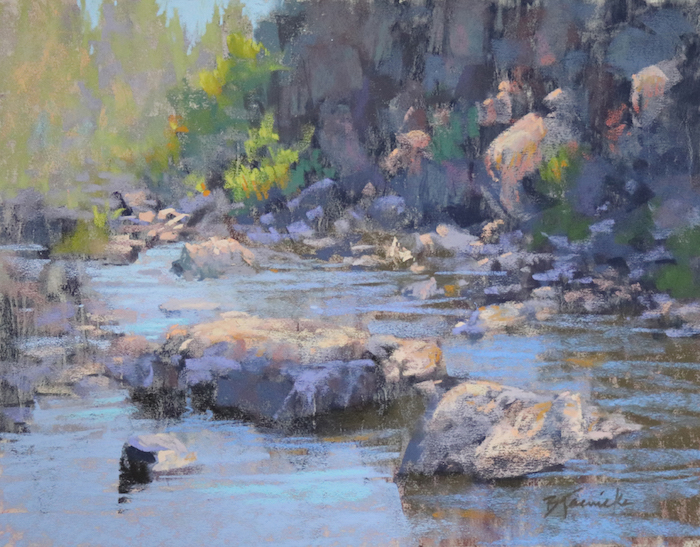
Before I hand the blog over to Barbara Jaenicke, here is a wee bit of information about her….
Barbara Jaenicke Bio
Barbara Jaenicke has been a full-time artist since 2002. She teaches workshops for pastel and oil throughout the US and conducts monthly online lessons. She has also produced instructional videos for pastel and oil, with another video on snow scenes in the works. Visit Barbara’s website for more information.
Now here’s guest blogger Barbara Jaenicke!!!
~~~~~
A strong design at the start of a painting allows for a better finish.
Most of my favorite landscape paintings by my favorite artists are those that depict the landscape with a well-edited approach, leaving many areas merely implied, yet the completed image still visually reads as a genuine, realistic capture of the landscape.
As I’ve studied the work of these artists and developed my own skills over the years, I’ve realized that the initial setup of the underlying composition for such a painting is key. My goal must be to pare down the initial composition to an arrangement of just a few shapes that vary in size. This initial process requires me to see my subject in terms of an abstract design before I begin to define the particulars of my subject.
Although my interest in painting has always focused more on representational artwork, not abstract artwork, I’ve eventually come to realize that a strong abstract foundation is crucial to any painting, no matter how realistically the subject is portrayed.
Keeping it loose at the start
Besides this initial set up of the underlying shapes, how I handle edges in this early stage is also important. By keeping the majority of edges loose and vague in the underpainting, I’m then able to later selectively choose edges to define. I create strong edge contrast and allow some areas of the painting to remain subdued.


The pastel medium is especially ideal for creating such a loose, edited block-in approach for a painting. Although there are many great methods to start a pastel painting, the method I’ll show and explain here is my personal favorite because it works wonderfully to create those loose, vague (and drippy!) edges, but still allows for setting up distinct initial shapes. With this approach, I can avoid over-defining too much detail at the start, which can otherwise result in a stiff, rigid, finished painting.
In my earlier years as a pastel artist, I found that it took quite a bit of practice and discipline to allow the looseness I needed in my initial underpainting if I wanted a loose, painterly feel to the finished painting. My tendency was to define specifics of the subject matter too soon, rather than prioritize a strong initial design. As I refined my pastel underpainting approach, I was able to strengthen my paintings overall, especially in terms of the more edited capture of the landscape that I’m always after.

Considerations for underpainting color choices
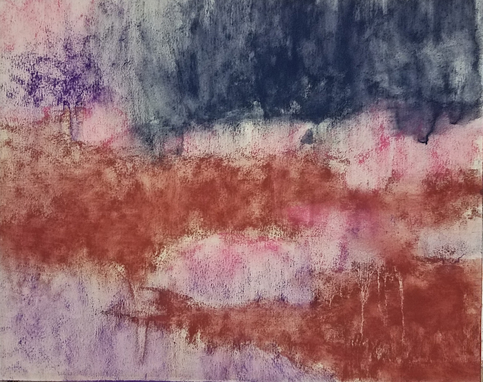
My favorite pastel underpainting method these days is to begin with only 3 or 4 hard pastels (usually NuPastels). One or two are usually a bright mid-value pink, orange, or yellow; a dark-value blue; and sometimes a violet that’s just a slight bit lighter in value than the blue. Occasionally I’ll use a warmer temperature for my darkest or middle value (such as a reddish-brown), instead of the blue.
The specific colors I choose for the underpainting are based mostly on value and temperature, but also sometimes on setting up a dramatic contrast with colors that will later be placed on top. These few colors are all I need to lay in an edited assortment of shapes, values, and temperatures. I can of course vary the pressure of how I lay in the pastel coverage, which will also adjust the specific value.

It all begins with the thumbnail sketch
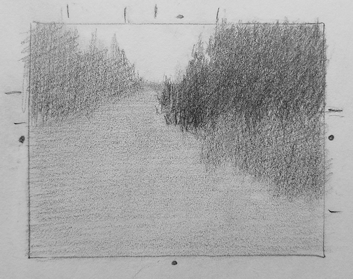
For any studio painting, I always begin with a thumbnail sketch. This is a crucial step, since it’s basically where I figure out the painting. In my sketch, I whittle down the shapes to about 5 -7 shapes. I squint at my subject to do this. I often shoot for a shape hierarchy, in which I have one large, dominant shape, and an assortment of other shapes in descending sizes.
To create this ideal shape assortment, I may need to combine similar-value subjects within my landscape to form one shape, even though they may be unrelated subjects. I also want to establish an overall edited range of only 3 – 4 values at this early stage. I generalize the value for each particular shape, ignoring the many value shifts within the shape, going with the prevailing value I see when I squint. In some cases, I may allow a shape to gradually fade from dark to light (if that’s how my subject appears when I squint), but otherwise each shape is a solid, flat shape at this stage. Defining form comes in the later stages.
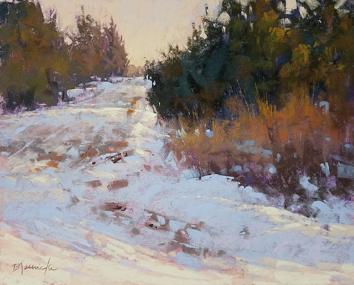
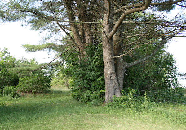
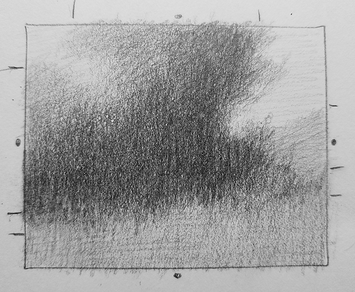
Reference photo, thumbnail, and final painting – Barbara Jaenicke, “Well-traveled Back Road,” 2019, pastel on UART Premium Board 320, 11x14in. Sold
In the following examples, you can see how I edited and composed my landscape subject in the thumbnail on which the painting was based. Notice on the thumbnail sketch how I’ve placed center marks and tick marks along the border so that I could deliberately vary the sizes of my shapes for an ideal assortment of shape sizes. Also notice how I created the thumbnail sketch to the same height-to-width proportion as my finished painting size, rather than the size of my reference photo.
Reference photo, thumbnail, and final painting – Barbara Jaenicke, “Clustered,” 2019, pastel on UART Premium Board 320, 11x14in. Sold
Reference photo, thumbnail, and final painting – Barbara Jaenicke, “Just Before Spring Thaw,” 2019, pastel on UART Premium Board 320, 11x14in. Sold
How I used this approach to create “September Aspens”
I painted a version of this image on location (in oil), where I initially established the basic composition that I used for the studio pastel version.

Back in the studio, I took my time to more clearly define and edit each shape in a thumbnail sketch, and determine a generalized value for each shape. I prefer using pencil for my thumbnail sketches so I can more carefully control how hard or soft my edges should appear.
At this stage, I’m focused primarily on a strong abstract design of shapes and value structure, not subject matter.
Reference photo and thumbnail for “September Aspens”
I begin by blocking in each shape with the hard pastels using fairly light pressure for most areas, allowing a little heavier pressure for the darkest shape. I allow for some edge variety at this stage, but I usually keep the majority of edges very loose and vague. In other words, I allow for a long, gradual transition from one shape to the other, so that, up close, it’s not readily apparent where one shape ends and the adjoining shape begins. However, if I back up (or snap a quick photo and view it shrunk down in a thumbnail size) the shapes are still very clearly defined.
With a #6 flat bristle brush, I then wet down the block-in with isopropyl alcohol. The manner in which I hold the brush is important for how I approach this stage. I hold the brush far back toward the end of the handle and allow the skinny side of the bristles to touch the surface. This allows me to merely coax the alcohol in the direction I wish it to move, rather than using tight strokes on the flat side of the brush, which will create rigid edges rather than the loose, drippy edges I’m after. I also make sure to load plenty of the alcohol onto the brush to encourage drips, allowing one shape to drip right into an adjoining shape, which loosens the edges even more.
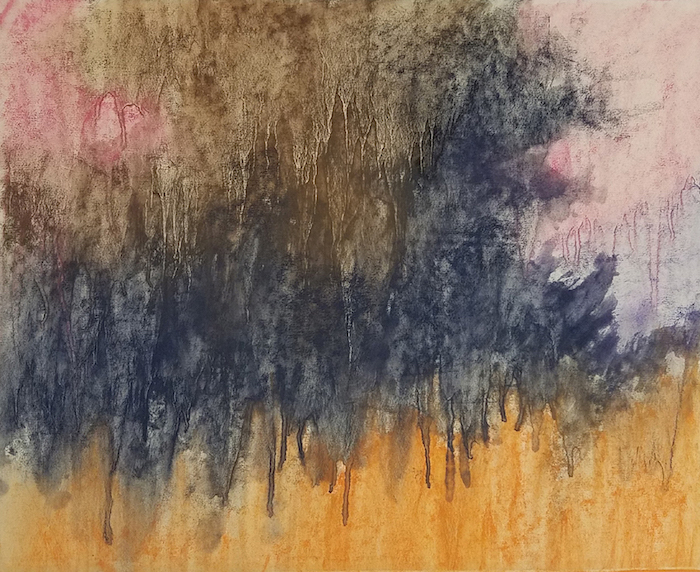
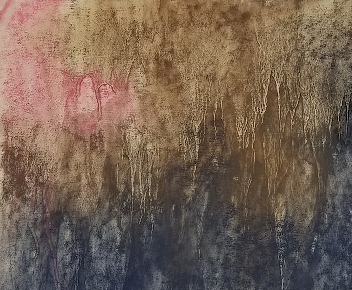
By setting up my underpainting in this way, I now have a foundation of an abstract design with which I can pick and choose areas to define, and allow less important areas to appear merely implied.
In the initial stages on top of my underpainting, my goal is to gradually define the value, temperature, and chroma of each shape. I move around to each area of the painting and focus on these important considerations much more so than defining detail. I also begin to break into my largest shape to begin to further define that shape. I’m paying close attention to shape variety as I address the smaller shapes within this large shape.

As I begin to define the specifics of the trees, I address the variety of hard and soft edges, and the variety of tree trunks sizes, the spaces between them, and the varied angles for each one. I’m also careful to maintain shape variety with all of the surrounding shapes, making sure each shape is slightly varied from the others.
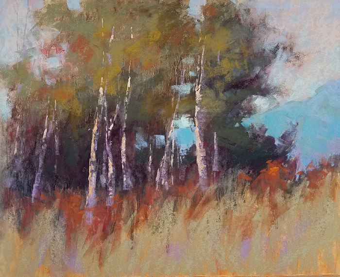
Little by little, I continue to define each area. I create varied-sized negative shapes within the tree foliage, and subtle temperature shifts throughout.

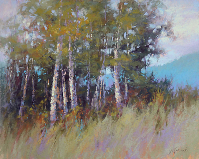
In the final stages, I push the local color of the grass and foliage so that it reads more closely to the actual color of my subject.
This particular painting relies quite a bit on edge variety, so as I complete the painting, I’m careful to observe that the edges throughout the painting are defined appropriately for the particular subject matter, and many less important areas of the painting are left with very little definition, allowing some of the original loose edges from the underpainting to remain visible. I also want to make sure that the initial shapes established in my underpainting are still very visible, even with the subject matter now defined.

Observing the underlying abstract design in a finished painting.
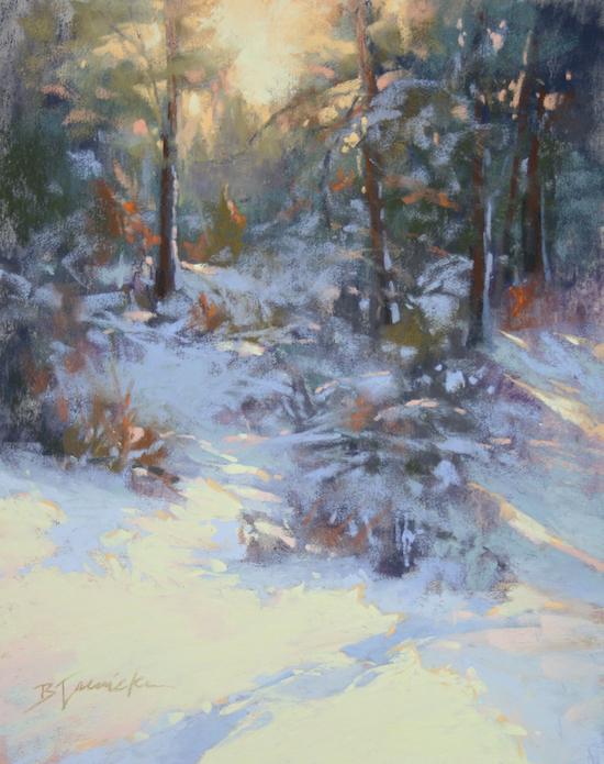
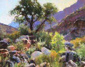
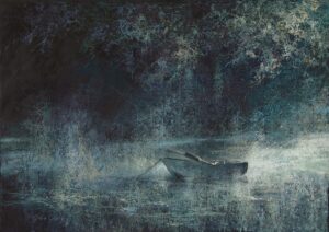
We usually only squint when looking closely at our subject, and keep our eyes opened wide when we observe our painting. But if you squint lightly at a finished painting, you can often see the underlying abstract design that the artist used as the painting’s foundation. If you squint lightly at all of the paintings shown throughout this article, you should be able to see that initial design. See if you can see the underlying foundation in these two paintings below.


*****
Wow!!! Was I right or was I right??? Amazing huh??
Barbara and I would both LOVE to hear what you think of her blog and work so please do leave a comment. If you have any questions, go ahead and ask!
And that’s it for now 🙂
Until next time
~ Gail

















100 thoughts on “Barbara Jaenicke – The Abstract Underpainting”
Very informative and well thought out blog! She does an amazing job of illustrating the importance of doing a thumbnail before embarking on a painting. I have taken one of her workshops ( which I highly recommend) and this is a good summary of what she teaches. Thanks Barbara and Gail for sharing!
Glad you enjoyed it Jan! I was delighted of course to see Barbara’s emphasis on thumbnails as I believe, as she does, that the effort put into creating thumbnails is absolutely worth it!!
Thanks, Jan! I’m glad you enjoyed the article and the workshop you took from me. Yes, understanding the thumbnail thought process is a biggie!
Been looking for how to begin a painting for some time. Really good info.
Thanks!!
Wonderful Kamisha!
This was so helpful! It is good to be reminded that it is well worthwhile to do the thumbnail homework before jumping right into the painting. Barbara, your work is so lovely. Thank you so much for sharing your process with us.
You got that right Wendy! You know how I loooove thumbnails so I was vibrating with happiness when I saw the emphasis Barbara puts on them 😀
Thanks, Wendy! Glad it was helpful. Yes, the thumbnail is where it all begins!
Have always loved Barbara’s work!
Great blog – thanks for posting.
Yay Terri!
I was thrilled to welcome Barbara as a guest blogger here!
Thanks so much, Terri! I sure appreciate that!
Beautiful work and thank you for sharing your process and thoughts
I agree Anna, about Barbara’s work, and was so happy she accepted the invitation to share her process with us.
Thanks so much, Anna! Thrilled to have the opportunity to do so!
What wonderful explanation of the process. Thanks for this blog.
You are welcome Gisela! And yes, agreed!!
Thanks, Gisela! Glad you enjoyed it!
This is absolutely wonderful information regarding seeing masses, the thumbnail (which I never do . . . but certainly will now), the underpainting – and using the brush on its edge! Barbara’s explanation of why it’s wise to begin with loose, undefined edges is an eye-opener and one that I will try hard to accomplish. Great article! Thank you Gail and Barbara!
Ohhhh love hearing this Dianne! As a proponent of thumbnails, it fills my heart to hear you say you will be doing them from now on!! AND starting loose 🙂
Thanks, Dianne! Understanding what you’re trying to figure out in the thumbnail sketch is certainly half the battle. And setting up edges at the start makes the process so much easier!
Really love Barbara’s approach to landscape painting- the subtleties of colour and value. I’m glad to hear that she uses Nupastels as an underpainting, because I have been trying to use a hard pastel layer as a base- I admit, a lot less successfully, but I think it’s about getting the basic shapes and composition right, as she says. Does she use alcohol over the Nupastels, or water?
Hi Judi,
Thanks for your question about alcohol or water usage. I’ll leave that for Barbara to answer 🙂
She explicitly says she used alcool. I however am curious as to the color of the paper. It would seem white works best?
Nancy, thank you. I must have been tired when I answered Judi’s question because as you say, Barbara explicitly states that she uses isopropyl alcohol for the underpainting.
As to your question regarding paper colour, Barbara uses UART mounted paper which is a cream colour. This allows the colours to sing as the light pierces through and reflects back from the paper. So yes, white or a light colour would work best.
She says in the above article that she uses alcohol. I have watched a couple of her videos and she uses alcohol in them also.
Thanks for the comment, Cathy, and for watching my videos!
Thanks, Judi! Yes, Nupastels work great for the underpainting. And, yes, I use alcohol to wet it down. I use UART premium boards so that I have a rigid surface that doesn’t buckle, and I also like that it’s less fragile than a thin piece of paper. As Gail said, the UART surface has a cream color, which works well with the underpainting approach that I use.
There is so much to “take away” from her explanation I will have to read it again and again. I already do thumbnail sketches, but have much to learn from the use of temperature and chroma. Thanks to both of you for sharing this !!
So good to hear Marie! And yes, reading info over and over at different times creates opportunity to receive and absorb the material in different ways.
Thanks, Marie! Yes, I guess I covered quite a bit in this article, and I hope that maybe if you read it a few times, you can focus on a particular topic each time to digest the information piece by piece. I appreciate the comment!
Thanks so much for sharing this blog. The process of identifying and blocking in the value shapes and then explaining so clearly how the under painting is approached is very useful. Very exciting, it just makes you want to get down to some painting straight away! Thank you
This is fantastic to hear Jackie!! I think identifying and grouping values is one of the most difficult and most useful seeing we can do as artists. Putting it into play can only serve to strengthen our paintings!
Thanks, Jackie! I’m glad I sparked some inspiration in you. I hope you’ve had some good results!
Beautiful work indeed!! I hung on her every word. So well done. I felt like she was talking to me in a one on one session. Thanks Gail for featuring Barbara on your blog.
Ooooo yes Ruth! Love that you equated Barbara’s teaching here to a one-in-one session. Evidently she spoke directly to you!
Thanks, Ruth! I’m so happy to hear that it was just the right information you needed when you read it!
I found the softness of Barbara’s thumbnail very appealing. It’s not the Notan Style of working! But i think the emphasis on very general shapes without hard edges will be really helpful for me. Love the under painting!! Mine usually end up as mud, but limiting the colors , detail and using hard pastels is going to help me out for sure! Thanks to Barbara and to Gail!
Ohhhh that is fantastic to hear Susan! You are so right about Barbara’s thumbnails being unlike Notans – I think they are at the other end of the spectrum!! I look forward to hearing how your work is affected by what you learnt here.
Thanks, Susan! You’re right, my approach is different from a notan. Since I work with edge contrast quite a bit in my work, setting up the edges right from the start is important in my process. The underpainting step does indeed take practice, but I hope you’ve had some success with the information.
This is a wonderful blog! I learned so much. I truly appreciate all that she shared and you, as well, for posting. Thanks!
Oh my gosh, that’s so good to hear Angela!!
Thanks, Angela! I’m so glad to hear that it was informative to you. And yes, Gail sure does a super job with this blog!!
This is another great lesson Gail; thanks Barbara. I always do thumbnails and now minis which help me figure out how to get into the painting. I will print out this lesson for the many good tips here! I always like my under paintings, but then tend to lose them in the process.
Glad you found it so useful Marsha! I think it’s cool that you are doing minis as well as thumbnails 🙂
Thanks, Mary! Any preliminary step that allows you to “figure out” the painting is certainly time well spent, so I’m glad to hear you have a planning process. And yes, staying on track with your original composition and value structure through to the end is important to remember!
Oh yeah!!!
Loved this blog! I tend to be a very impatient painter so I really enjoyed seeing Barbara’s process as well as being introduced to her beautiful work. Thank you!
OH I LOVE hearing when someone has just discovered a new-to-them artist! How exciting!! Glad to hear that Barbara’s lesson might slow you down in your painting process MaryAnn 😁
After reading this blog, I looked her up and found out I had something in common with the artist. I was born and raised in NJ also. 🙂
Just saw your additional comment, MaryAnn…Glad to hear from another Jersey-girl! I was born and raised in central NJ until ’92. Lived in Hamilton, Plainsboro, and Hoboken.
Thanks, MaryAnn! Yes, impatience is a common stumbling block that trips us all up. A little planning at the start goes a long way!
I’ve been a fan of Barbara’s work since I first discovered her some years back….and her generous descriptions of her process is truly inspiring. She is a true master…..thank you, Gail and thank you, Barbara…!!!
Totally agree with you Curt – Barbara is a true master indeed, not only in her work but also in her clarity of explanation!
You’re very welcome, Curt! I sure appreciate the nice comment, and am glad you found it inspiring!
Thanks! This held some timely reminders for me. I am working with oil at the moment, but found the discussion of soft edges and varying colour temperature addressed some of my current issues with colour vs value. I seem to be a slave to local colour.
I would be interested to know the thought process behind which colours she chose to paint the “green” areas.
Judy thanks for popping in and letting us know you are working in oil as so much of what we talk about on HowToPastel is applicable across painting media!! And I’m glad Barbara’s blog was so helpful to you.
Great question which I will leave for Barbara to answer 😁
Thanks, Judy! I’m glad you found the information helpful. I also work quite a bit in oil, and much of what I talk about here also applies to oil. When working with greens, or any color really, I pay more attention to value, temperature and chroma, than the actual local color, and then sneak in a bit of the local color to allow it to “read” as the color it’s intended to be. Often, local color will be most evident in the cusp area between where a sunlit area turns to shadow.
Fabulous tip Barbara!
I am thrilled and inspired and I thank you both for sharing this wealth of experience!
Awesome Joy!!! And you are so welcome 🙂
You’re very welcome, Joy! I appreciate the nice comment and am glad you found it inspiring! And yes, Gail sure is a rock star for providing this blog to offer so much information!
🙂
Thank you, Gail, for inviting Barbara! Thank you, Barbara, for being so generous with your knowledge! Absolutely love your work!
Thank you Lana for your appreciative thanks yous!! 😁
You’re very welcome, Lana! I sure appreciate the kind words! I’m a fan of your work, too! 🙂
Barbara’s emphasis on abstraction is something the really resonates with me. What a great lesson! I plan on using this technique—hopefully today. I love your blog Gail and the generous sharing of your guest artists
Thanks so much Liz! Wondering if you did apply this most important and resonating-with-you lesson?! 🙃
Thanks for the nice feedback, Liz! An abstract approach sometimes seems counter-intuitive to some, but I’m so glad to hear that you could identify with it. I hope you had success with using the technique!
This blog article connected a lot of dots for me, particularly with underpainting and loose edges. I had never considered the angle and length at which one holds a brush with regard to the alcohol drips, yet I can see how different the effect (and impact) on the finished painting that would have. The thumbnails I have been probably less disciplined about, but the way Barbara did it, honestly some of those pencil thumbnail sketches reflect the mood of her finished painting at a very early stage of the process. Before, the importance of a thumbnail sketch was merely to answer the question “does the overall placement of objects seem to work?” I feel very differently about thumbnails now. Thank you, both, so much. I’ve really learned some thing and your work is beautiful! So generous of the two of you—
Nancy thank you for your in depth recounting of your takeaways from Barbara’s post. I agree with you about her thumbnails- exquisitely mood-provoking capturings of what she wants to express beyond mere shape placement and value design!!
Thanks so much for the thoughtful comment, Nancy! Yes, boiling down that mood into just a few shapes in a tiny sketch can really force you to zero in on what you want the painting to be about. I’m glad you found so much of the information helpful!
Barbara has such a thoughtful painting process! I love her work – so painterly! Her marks are strategic – such a nice balance between impressionism and realism. Her understanding of value and temperature are amazing – so luminous! I took a workshop from her a few years ago – watching her work was inspiring. In three days I learned to take an entirely different approach to creating my own artwork!
Mary, thank you so much for sharing your enthusiasm for Barbara’s work and her instruction. I’m glad you brought attention to her mark-making because you are so right about her marks being strategic and intentional!
Thanks so much, Mary! I really appreciate your comment about my mark making, as that’s something I focus on quite a bit in my work…to go beyond just a realistic recording of the image. To me, the mark making is what makes it “art.” 🙂
Great tips for how to begin. Love Barbara’s work and your blog. Keep up the good work, Gail!
Good to hear Mike. And thank you!!! 😀
Thanks, Mike! Yes, a well-planned start can make for a more successful finish for sure!
Thank you Barbara for being so generous and providing so much excellent info. I especially appreciate seeing the 3 pics of each work side by side. I have done 6 or 7 of your Monthly lessons with your critiques. I can’t say enough about how fabulous these lessons are and your critiques are so right on. When I receive one of your generously thorough critiques and read it through, often my first reaction is prickly BUT then on a second reading while actually looking at my painting my reaction changes 180 degrees to ah-ha, of course, now I get it and I’m so thrilled to understand another piece of this mystery puzzle we call painting. You are one of the best, most thoughtful, instructor/mentor I have ever had. I have had so many more compliments about my work since your lessons.
Carol, high praise for Barbara indeed!! I am sure she will be most appreciative of your generous words!! 😀
And I laughed and nodded when I read about how “prickly” you felt after a critique but then had the wisdom to be open to it thereby creating stronger work. Brava!
Thanks so much, Carol, for the kind feedback on this blog article, and on my lessons and critiques. Had to laugh, too, about the “prickly” comment…I have a feeling I have that effect on most people when I critique their work. 😉 But I’m just glad it ends up being helpful in the end. I’m especially appreciative to hear that your work has been getting such positive response since completing my lessons…I’m so thrilled to hear this!! 🙂
Thank you Gail for inviting Barbara. You are also one of my most favorite instructors and I eagerly await each of your blogs.
It was my pleasure to invite Barbara and I am so pleased she accepted the invitation!!
And thank you for your very kinda words to me Carol 😀
Dear Gail, you were…right. I have tried it out and the possibilities are amazing. First I used sand color paper, producing a result looking like a mud flat.I used it anyway though. But I then switched to white paper–much better. Once the underpainting/alcool and first colors were laid over, I tried putting on more alcool with a sponge and that’s where things got really interesting. The underpainting colors came out again, giving surprising effects. One gets different forms, much more interesting than the usual ones (I speak for myself of course). It really gets one out of the old habits.
I’m just at the trial-and-error stage but this is definitely a breakthrough. Thank you for bringing it to us.
**I should like to mention that the alcool seems to be a very dangerous liquid; the manufacturer recommends using heavy rubber gloves, eye protection, face mask etc; ( I skipped the last two) so caution is advised.
Nancy, LOVE LOVE LOVE that you are experimenting!! This is when amazing things can happen and take you places you may never have gone otherwise!!! Yay you!!!!
Thanks for the feedback on your explorations with underpaintings, Nancy! With pastel and underpaintings, the options are limitless, so experiment away! Depending on what type of alcohol you’re using, the hazards may vary. Regular isopropyl (“rubbing”) alcohol really isn’t very dangerous to use it in the way I do for underpaintings. However, I do always wear nitril gloves when I paint (in pastel or oil). And using common sense to avoid breathing it in is certainly a good idea. I keep it covered until I’m ready to use it, and then put the lid back on as soon as I’m done.
Thanks so much for fleshing out this topic Barbara!
So well written as usual Barbara! It is such a treat and so fascinating to see the abstract beginnings of these beautiful pieces. Very inspiring . Thanks to both of you.
Hi Jeanne, thanks for popping in and adding your voice!
And I agree with you – I LOVE seeing those abstract beginnings of what is essentially a-piece-of-reality paintings.
Thanks so much, Jeanne! I appreciate your feedback on the abstract approach as much as your comment about the writing! 🙂
Hii, thanks sharing these information. this is awesome article as always. I am glad to gain this remarkable information from you. these is best blog, I like it.
Hi Kumar, thanks so much for your appreciation. Great incentive to keep going 😀
Thanks for the sweet comment, Kumar! I’m glad you enjoyed the article!
So happy to have stumbled on this blog event. Barbara’s work is stunning. Love the pics showing the build up and final outcome. I too will be paying closer attention to thumb nail prelim. Thank you for this interview and post.
Hi ArtDreamer!! I’m glad you discovered my blog too 🙂
I was so happy to have Barbara and her beautiful work on the blog. And I loved the way she talked about and creates thumbnails, a preliminary exercise I am passionate (and adamant!) about. Great that you are going to pay closer attention to your own thumbnails.
You may enjoy this post I wrote about the benefits of doing thumbnails.
Thank you, Gail and Barbara, for this wonderful post.
Being a long-time pastel painter I have continued to work on Canson gray paper but seeing Barbara’s work has convinced me to switch to a sanded light surface and make better use of my Nupastels for underpaintings.
You have also convinced me of the importance of a thumbnail. I have always jumped right into the finished painting but I can see how your approach can help me to produce the more loosely, Impressionistic type of pastel painting I have often admired, especially Barbara’s, and consider her one of the best – nobody paints snow like Barbara Jaenicke – and I will be rereading this post often, as a matter of fact I have downloaded one of her monthly lessons and look forward to working with it and getting her critique.
So glad you found it useful and inspiring Elaine. And I’m so pleased you can see the benefit of doing thumbnails as I’m a HUGE proponent of their use!! And I’ll be curious about your switch to sanded paper and how it goes. Barbara’s post is here for you to come back to time and again.
I’ve learned so much here just from the comments! Thank you so much.
Oh that’s maaaahhhhvelous to hear Kristina!!
Thank you so much for sharing Barbara’s work! She is an amazing artist. I LOVE her work!
You are welcome Dee!! And yes, Barbara’s work is certainly something special!