You’ve heard me going on about doing your thumbnails right? But then comes the natural question: How do I go from thumbnail to underpainting? Goooood question. It’s all well and good creating thumbnails but then what?? And the easy answer is this – make a colour copy of your thumbnail right on your paper. Yup, it’s as simple as that!
Let’s have a look at a few of my recent pieces to show the step from thumbnail to underpainting. You’ll see how all the underpaintings echo the thumbnails.
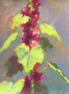
The first selection is a jug full of flowers. You can see in the thumbnail the one area of light. And can you see it again in the pastel underpainting?


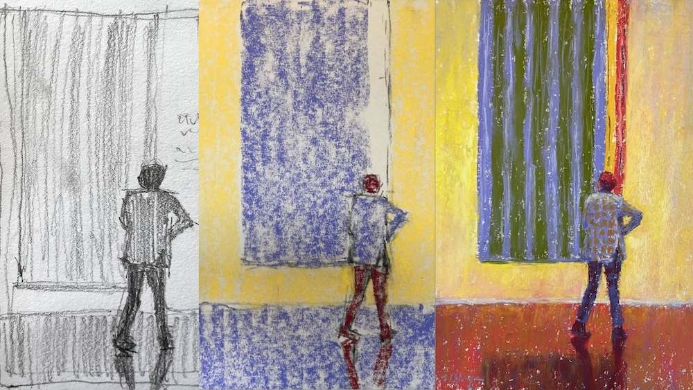
Next up are three paintings from my Gallery Goers theme.
In the thumbnail below, you can see there are only two areas of dark. They take up a relatively small amount of space in the design. In the underpainting, I’ve created those same dark areas with a deep intense blue while the middle value is applied in an ochre colour and the light in a pale blue. You can see how I lay down the thumbnail pattern in colours and values that correspond to the same values of each area.


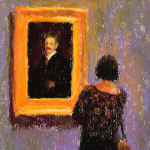
In this next painting, the dominant value is a middle value with only a smidge of dark in the person’s head, pants, and reflection on the floor. While working on the painting, I realised that I’d forgotten to include the reflection of the painting where it darkened the floor. I liked the darkness in the foreground and decided to include it even though it’s not in my thumbnail (gasp!). Ideally, I would have done a thumbnail of the new design. (This is what I always tell my students to do! It’s a matter of: Do what I say, not what I do!)
Another thing, the size relationship between painting and person is off in the thumbnail but decreasing the size of the figure. You’ll see there’s a strip of paper untouched by pastel. Just hadn’t added the light (yellow) before snapping the photo.


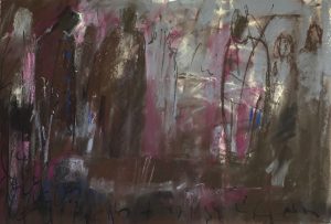
The painting of the Three Ladies is light-dominant. There are a few areas of dark and if you look at the initial underpainting, you’ll see that I forgot to replicate one of those areas from the thumbnail in the underpainting. Do you see where? This was soon rectified and appears in the final painting.


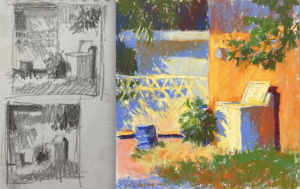
The next painting was done en plein air. The thumbnail was done very quickly but I jotted down my three value choices. The darks are the door and the pots. You’ll see in the thumbnail that I also added some dark to represent the tree branches in the upper left but as I wanted these to be added as I needed them in the painting, I didn’t include them in the underpainting. This is unusual as I generally copy my thumbnail onto the pastel paper as is. Sometimes, however, I change things up. I never want to paint in a completely formulaic way!!


And finally, a painting from my Dog Walkers theme. The middle value is certainly dominant here! Can you see how the underpainting echoes the thumbnail?


Each of these sets pretty much shows how I go from thumbnail to underpainting.
You may be asking how I choose the colours for the underpainting. Sometimes I choose an opposite temperature. Sometimes I look for an underlying colour. Sometimes I exaggerate what’s there. And sometimes it can be a bit of a random choice. The most important thing is I pick a hue that corresponds to the value area of my thumbnail.
All the colours are relative to one another – one is lighter and another darker and another darker still. This is the most important consideration!
Were there any surprises here? Did the step from thumbnail to underpainting make sense? Let me know in the comments below!
Until next time!
Gail
PS. I go DEEP into the subject of choosing first layer (underpainting) colours in my Pastels 101 signature course!








![Pastels on black aper: Gail Sibley, "Untitled [at this point], Mount Vision pastels on Sansfix pastel card, 5 1/2 x 7 3/4 in](https://www.howtopastel.com/wp-content/uploads/2016/04/IMG_9649-2-150x150.jpeg)




6 thoughts on “From Thumbnail To Underpainting”
Hooray for today…
Thank you for posting this Gail I’ve been itching to try this since your thumbnail webinar. Thank you for unpacking it with so many examples.
And oh to pick a favourite favourite from them near Impossible, black hats…(snap…love it)
Checks ans stripes (I love how dwarfed the viewer is by the ginormous painting and her knock-kneed pose making her seem vulnerable and a bit quirky)
(The warmth in) Welcome
Last walk (the glow from backlighting)
Once again inspired
Ahhhh Melanie, thanks so much for taking time to look at each example and share your thoughts. You always can put a smile on my face! AND, I’m always glad to hear when you’ve been inspired 😁
Lovely work Gail.
The Dog is my favourite one! 😁😁😁😁😁
Thanks Ed! I’m partial that dog walker too.
Good morning Gail, I was moved to leave something to help support your generous pastel teaching blog, but didn’t because there is no way to pay other than a credit card number. I never post my cc . Please consider using PayPal, Apple Pay and some additional methods that put an additional means of safety .
It’s also easier for the donor as many of us don’t have our cc number memorized.
Hi Carol, thank you so much for the thought about supporting me with a donation.
I used to use PayPal for everything but I ran into a problem and then heard awful stories from others that I’ve switched almost entirely to Stripe, a company I trust with our financial details. Stripe does not retain your credit card details unless you are part of a recurring payment plan.
I haven’t looked into ApplePay – I’m not sure how it would work on a blog post. I will see if that’s a possibility.