Recently in my IGNITE! art-making membership, I asked members: What’s your favourite lesson so far? Happily, many of them said they found it difficult to make a decision (“A difficult question- each lesson has been so valuable”) but one of the lessons that emerged as a group favourite was the one on value dominance.
And what do I mean by value dominance you may ask.
Simply, it’s the idea that one value prevails over all others. The best time to put this idea to work is when you’re doing your thumbnails (and you know how I looooove thumbnails!!). The thing is to make sure one of your three values – dark, middle, light – covers a large proportion of the surface. You choose which value depending on the subject and the desired effect.
This concept of value dominance first came to my attention years ago when I was reading Harley Brown’s book, Eternal Truths For Every Artist. There, he shows a rectangle with three values taking up almost equivalent space….and it’s….well….it’s boooorrrrring!
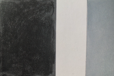
He then shows another example. This time, one value – in this case, the dark – takes up more than half the surface, while the light value occupies only a smidge of space, and the remainder is a middle value.
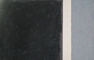
Whoa!! Sooooo much more interesting.
And those are just rectangles of black, grey, and white. Imagine these areas in a more dynamic arrangement with each other – a powerful painting in the making!!
The thing is, even when we know this concept, we often forget to incorporate it when doing our thumbnail planning. Raise your hand if that’s you. (I’m definitely raising my hand! 🙋♀️)
And yet it can make such a powerful difference (as members in my IGNITE! community have discovered!).
Let me show you what I mean through a variety of thumbnails.
On a visit with my friend Sandy last fall when it was still warm enough to sit outside (the best way to visit during the pandemic!), I took a photo of him that I’ve been wanting to paint since then. Naturally, a set of thumbnails is in order before proceeding to the painting stage.
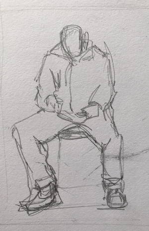
The first thumbnail below comes closest to what I see in the photo. When you’re creating thumbnails, you’re making judgements and choices about which areas to slide into which value.


When you compare the two thumbnails – middle value dominant and light value dominant – you can really see the difference in the effect on you as a viewer. Then compare them to the initial thumbnail and see how much more powerful they are, even though they hold different value dominances.
Let’s have a look at a few other examples. You’ll see dark value dominance, middle value dominance, and light value dominance.

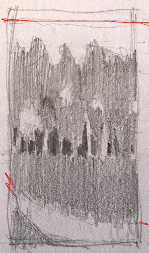

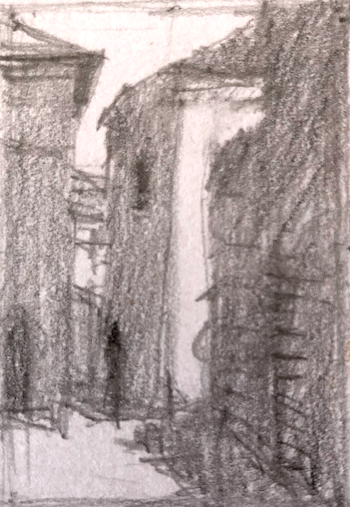

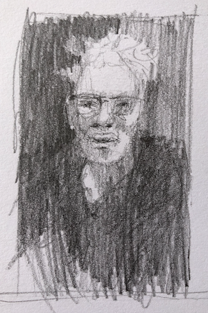
I hope this gives you an idea of what I mean when I say value dominance and I hope you can see how using it can strengthen your painting.
The best way to play with this idea is in your thumbnails. Keep them small and work quickly. This is where you can experiment and push this dynamic effect!
So far, I’ve only used one of the thumbnails above to create a painting (Tuscany Vista) but I can’t wait to use the rest of them!
Creating thumbnails is such a great way to use your time when you aren’t quite up to painting. When you do feel like putting pastel to paper, hallelujah, you have an inventory of thumbnails to work from and you can get stuck into painting right away. How cool is that!!!
Remember, equal amounts of value can equate to a boring painting. So try, when you get to planning your painting, to put value dominance to work.
I’d LOVE to know what you think of this concept. Do you use it? Or is this a new idea for you? Let me know by leaving a comment. Feel free to ask a question too if anything isn’t clear.
Until next time,
~ Gail
PS. Harley Brown’s book – one that I’ll never part with!!


![Pastels on black aper: Gail Sibley, "Untitled [at this point], Mount Vision pastels on Sansfix pastel card, 5 1/2 x 7 3/4 in](https://www.howtopastel.com/wp-content/uploads/2016/04/IMG_9649-2-150x150.jpeg)




28 thoughts on “Value Dominance! How it Can Make (or Break) Your Painting”
I found this blog so interesting! I never thought about adjusting painting in way. Thank you!
Sharon that is so great to hear!! It’s a fantastic way to up the strength of your painting!
Very interesting topic! I’ll try it out. Thank you!!
Super dooper Anne! Come back and give us a report on how it goes!
Never can get enough about value and creating value dominance…..thank you!
Ahhhhh….I’m glad to hear that Ann Marie as I’m always hoping I don’t flog the topic to death 🤣
The article was extremely clear, concise,and very useful. Thank you a bunch.
Lovely lovely LOVELY to hear Patricia!! And you are so welcome 😁
Of course! Eureka moment – this makes so much sense! Great post Gail, thank you.
Ohhhh I LOVE hearing about eureka moments!! Thanks Morag!
Fantastic article Gail. Great visual reminders, I will be bookmarking and sharing! Thank you!
Gosh Jeanne that is wonderful to hear!! Thank you!!!
Great job addressing this topic, Gail. At first I thought, oh yeah, more stuff about value, yada yada yada….but then I really looked at what you’re doing, and what value dominance actually IS (which you so clearly portrayed through your sketches), and now I’m all excited to actually DO a thumbnail sketch!! Thanks so much, Gail, for waking me up FINALLY to the value of value!
Ah Paula, you made me smile…a big smile…for so many reasons…starting with your “yeah yeah more stuff” to your “I’m all excited” to “waking me up to the value of value.”
And I’m not sure you realise how rewarding it is to hear that. Whoop whoop!! 🎉
This blog post is of great VALUE to me, thank you Gail!! 😁 It leads me to the question whether or not you can make equally strong paintings by applying COLOUR dominance (while all colours stay in the same value range)?
Regards, Gabriela
Hah hah – love your play on words Gabriela!
You can make good paintings with colour dominance BUT perhaps not strong ones. Imagine it photographed in black and white …where’s the underlying punch? You can make your work stronger by incorporating BOTH ideas.
I would say to try making two paintings of the same subject. One painting focuses on colour dominance and ALSO keeping those colours in the same value. The other painting uses the same colours BUT you choose the colours according to the VALUE structure.
I think I’m going to bring this Challenge to the IGNITE! membership 😁
Thank you for writing this, you’ve put it so well! I learned this concept from Carol Marine in her workshop years ago, and have been still struggling with it ever since. I TRY to tell my students about how to do it, but I still fall flat myself most times, in my own paintings.
Now, when someone asks me to elaborate, I can send them to THIS post! 😀
Oh my gosh thank you Rita!!
Certainly, it’s an easy concept to grasp in theory but harder to put into action. One thing I’ve found is that whenever I teach about value dominance, I often realise that I’ve let it slip from my work. And so teaching, as you know, is always a good time to re-examine what we as teachers do in our own work!
I must admit I seldom do thumbnails!!! I tend to be lazy and want to go straight to painting. I am determined to think out a painting before actually starting and your info on value has convinced me to do just that. There are plenty of times I have a painting in mind, but not quite ready to start…perfect time for thumbnails!!! Thanks!!!
Hey Kathryn, I know that feeling to just get painting! I relate to lazy that’s for sure 🤣
And I’m deeeelighted that you are going to try to plan your paintings beforehand – glad this post helped confirm that determination!
And yes, use not-up-to-painting times to create thumbnails. It’s such a joy to come into the studio, ready to paint, and hey, a whole catalogue of thumbnails to choose from!
I sometimes forget about value dominance, but when I do remember to really pay attention to it the painting is almost always more successful.
Whoo hoo! I LOVE hearing this Anne! It’s easy to get wrapped up in just getting things down and decided with value dominance forgotten in the moment. It takes intention to include it and as you say, when it’s part of your painting, BOOM! success much more likely!
I had never heard of value dominance before. This is incredible knowledge.
Another thing I learned this week is about creating a lighting hierarchy for landscapes. Having one area with the most light is one way, of several, to create a focus for the painting.
Thank you so much for sharing your knowledge. You are amazing.
Hi Mark, thank you for such an enthusiastic response to my blog – so makes it all worth it!!
And thanks for sharing your learning about the hierarchy of lighting in the landscape. I hadn’t heard it talked about in that way! Cool.
Dear Gail, you are a fine teacher! Even though I had to drop out of the Ignite program I still get great value from your blog lessons—I just read this lesson today! How valuable it is! I have not given dominance any thought but I will from now on. Your examples were great for learning. I so enjoy your teaching—keep up the great work.
Thanks so much Renee!!
I was sad to see you leave IGNITE! but I know that life can mean change, sometimes in ways we don’t expect. I’m delighted to keep teaching and sharing via the blog!😁
Every time I hear more about value and value dominance, a little more sinks in – repeat, repeat, repeat. Good blog post, Gail, and thanks for repeating, repeating, repeating.
Awesome awesome awesome!! 😁