Colour. I LOVE it! And, I love playing with colour.
So what do I mean by playing with colour? I mean exaggerating the colour I see and occasionally changing it up completely! Sometimes the colour needs a bump up or at other times, the painting itself calls out for a colour that’s totally different to what’s there in the scene.
I’ve just uploaded a video to YouTube with a demo (sped-up) that shows me playing with colour. I end up with a pretty colourful painting! Yet, when you look at the reference photo, you’ll see I really pushed and changed the colour.
First, have a look at the video:
Now have a look at the reference photo. Dull isn’t it? Yet can you see how the relationship between the two companions along with the way their bodies move attracted me?
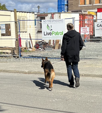
Because I didn’t need to copy what was there, I was free to change up the colours.
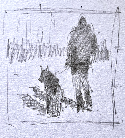
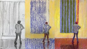
As always, I first made a thumbnail. I especially wanted to work out a value plan for the background. I knew I wasn’t going to include all the stuff beyond the figures. For my purposes, it added nothing to what I wanted to say. So, I left it all out. And then what? You can see in my thumbnail that I just indicated an area of middle value. I could decide what would be in that value area as I worked on the painting.
Then, with vine charcoal, I drew up the image on a 6 x 6 in piece of UART 400 paper. You can see where I readjusted the placement of the dog.
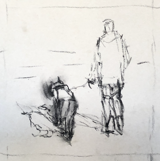
And then came putting in the three main value areas as my first layer. I like doing this to replicate the pattern I’ve created in my thumbnail.
Initially, I imagined doing the coat in blue and felt the warm orange would create an exciting underlayer. However, I loved the orange so much, that I decided to make the coat orange instead! So I left it as is. This is why it’s good to leave yourself open to the possibilities that arise as you work.
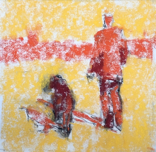
I build up the image as I go. I work from the big shapes, adding detail nearer the end.

Finally, I cooled and softened the background so the two figures would stand out and there would be a feeling of space beyond them, even if it wasn’t clear what lay in the distance.

Have a look at the painting in black and white along with the thumbnail. You can see how I stuck with my plan. I really want you to see how when you have your values down, playing with colour becomes a breeze! Imagine this piece all in blues – wouldn’t that create a completely different feeling?


Here are the eight Unison Colour pastels (from my set) I used in this painting.

Let me know if this has inspired you to play with colour! And, if you have questions, do leave them in the comments below.
Until next time,
~ Gail
PS. The light areas dominate in this painting. To understand more about value dominance, click here.
PPS. Want to see the painting develop in real-time with a full voiceover? Then join us in the IGNITE! Art-Making Membership. We go deep into colour!!
PPS. I wrote an earlier blog post about Pushing Colour.
















18 thoughts on “Playing With Colour To Create Unique and Bold Paintings”
Bloopers were amazing. And I guess the painting was good too ;}
Hah hah! Good to know you watched the WHOLE thing lol!!
Hi Gail, Just watched your blog/video of the dog walker. Thanks for sharing this as I do struggle with colour … who doesn’t?! No actually, I need to focus more on my middle colours. I tend to forget about them and then lose the depth of field in my paintings. I too love the idea of changing up the colours in a photo. It was such a pleasure to watch how you transformed the photo with your vibrant colours and I really liked how you blurred out the background. Always fun and informative to watch your videos.
Happy Easter …
Gloria
Thanks Gloria! Each painting is a whole big experiment!!
Loved this demo. Brightened up my day, definitely going to try this out.
Hey Izzy, I love hearing that – both that you loved the demo and your day was brightened, AND that you’re going to try it out!!
This is a real transformation of your original photo. I love how it turned out. I’ll be studying it to take in all the lessons in this post. I found the way you did the shadows and the highlights on the back of the woman’s jeans really great and love how you transformed the ho-hum background in the photo to one that works for your painting. Thanks for posting this one, Gail. Love your blog.
You are so welcome Carol. I’m delighted you had some takeaways from this post!
You’re so funny, love the bloopers at the end. As always, very inspiring video and encouraging. Thank you for sharing your craft.
Abby
Hah hah. Good for you sticking it out right to the very end Abby! AND, glad the content itself was useful and inspiring 😁
Love your little 6×6 gems! Both the color and YOU are delightful.
Awww thanks so much Gailen. And how lovely to hear from you!!
I know these things will only become easier and develop if I PLAY with color. Thank you SO much for this video and the mini course gift! I love watching for bloopers at the end, and you didn’t disappoint! I have a dog photo that my friend wants me to paint, and It is less than inspiring. But this gave me some ideas. Thank you so very much!
You are so welcome Sue! And yup, I still manage to find some bloopers 🤣
Play play play – that’s how you’ll learn. It’s hard sometimes to get over preciousness and experiment but yes, that’s the way to develop your colour skills.
Let us know how your dog painting comes out!
Hi Gail,
I loved this demo about playing with color! I’m going to try this on my easel tonight & hopefully I’ll be able to send you the result. You’ve explained this method exceptionally so I was able to understand this kind of thinking, e.g. “I don’t have to be a slave to the actual colors in my reference.” I’m allowed to play! So freeing, thank you for sharing your knowledge.
Yeah Patti!! I’m so happy to hear that I communicated these ideas clearly. You, you really are the artist!!
Wunderbar
😁