I’m often asked if I start with an underpainting. And I say yes, I first put down a dry pastel underpainting which echoes the shapes of value I’ve chosen in my thumbnail. I always start with these big shapes as a way to lock in the foundation of my painting.
The big shapes create the foundation on which everything else sits. It’s invisible in a painting unless you’re consciously looking for it. Usually the viewer sees colour or feels a mood and may experience an emotion. Until they examine why that happens, these large shapes that form the cornerstones of your painting may go unnoticed.
Simplifying a scene into big shapes can spark creativity. Doing so encourages you to interpret and represent the subject in your own way, emphasising what you find most interesting or significant.
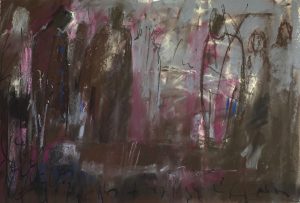
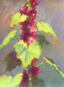
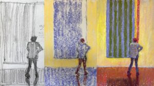
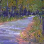
Let me take you through five paintings done during the recent 31-pastels-in-31-days Challenge. I’ll show you the pastel underpainting (the colour version of my thumbnails with its value pattern/design) and the final painting with an accompanying black and white version so as to see the retained big shapes of value more easily.


Hopefully you can see how those big shapes, both of value and content, create the underpinnings of a painting. They act as the bedrock on which all else is built. Viewers of your painting will sense and respond to it, even if unknowingly!
By concentrating on big shapes first, you postpone the temptation to delve into the details until the overall composition is settled.
Starting with big shapes can also build your confidence as they provide a roadmap. This makes it less intimidating to progress to smaller details as you move forward in your painting.
I’d love to hear your takeaways from this post! Do you paint the big shapes first? If yes, how does doing that help you? And if not, have you been persuaded to try??
Until next time,
~Gail













20 thoughts on “Paint The BIG Shapes First”
Hi Gail, the way you demonstrate getting those big shapes in for setting the value is really interesting. Do you set that underpainting with alcohol or water, or do you leave it as is and then just start layering on top of it? I’ve always used alcohol to set the underpainting but lately have been disappointed with sone of those results.
Hey Heather, thanks for your question. I don’t use anything but soft pastels and start layering right on top. I do apply with a light pressure though so as not to fill up the tooth of the paper too quickly!
Thanks, Gail, that was so helpful. While I remain aware that big shapes are the way to go, I usually plow right in without them. Your examples were a good lesson for me to take to heart and I will come back and look at them several more times, which ought to help!
Thanks for all you do to encourage us to keep on keeping on in the improvement game
So glad to hear it was helpful Wendy! It really does help to use these big shapes as your guide and then work into them to create more details.
Hi Gail, I stopped painting towards the end of our second lockdown and started woodworking instead though I continued to read your posts. Following surgery,which was minor but prevents heavy lifting, I have started getting back to art in the last few days. I am starting with oils and gouache but suspect it won’t be long before I get the pastels out again. Reading your post today made me think that I could apply the same techniques oils providing I give the underpainting a week or so to dry. This may lead to more exciting paintings than my usual alla prima approach and may even teach me patience. Thank you for your continued inspiration.
Hi Eddie – great to hear from you. Thanks for sharng your art journey since the second lockdown. I’m glad to hear you are back to painting again! Oils and gouache are wonderful painting mediums and quite different from each other! As you’ve discovered, this idea of big shapes can apply to any artwork you’re doing. (I was going to say two-dimensional work but realise the same can apply to sculpting whether additive or subtractive.) If you use oil with a medium like Gamblin’s Galkyd, it will dry fairly quickly.
A great reminder of beginning a painting with big shapes. I find your underpainting colors very interesting. Seeing the progression from the underpainting to the beautiful final painting is inspirational! Thank you Gail!!
Thanks Ruth!! I’m glad it’s a good reminder 😀
Gail: What a nice treat to see this well-presented refresher on the importance of shapes and their value. I usually start with a simple tonal study to aim for a pleasing value arrangement but often the structure gets lost with my poor color choices. Your examples of thinking about the underpainting color at the same time as setting values is a great reminder for me and will help me stay on course. Like another commenter, I would have thought you had washed in the underpainting w liquid – I should have know you do the direct layering approach since your paintings have that signature richly multi-colored almost impasto feel. Long time fan – love your work and thank you for your unflagging efforts to make us better painters!
Pat – thank you for your warm appreciative comment!!! I am smiling ear to ear!!
I look forward to hearing about what happens when you start thinking about the colour choices as you are creating your value study. You may enjoy this post I did on colour studies.
Thanks Gail.
You always make everything look so easy. With the big shapes as an underpainting or any underpainting for that matter, my issue is always what colors should I use. How do you make that determination? Thanks
Hey Christine, I’m glad I make it look easy lol because really, each painting feels like new territory – I’m never quite sure what will happen! Choosing the colours for the first layer can be an adventure! Some of the things I consider are – if the painting is going to be generally cool, I may start with warm colours. Sometimes, I’m looking for a secondary colour eg green grass – but it has a bluish bias so I may use blue as my underpainting middle value. Sometimes, it’s all a bit random! As I mentioned above, this post may be helpful. You could also check out this one!
That was fascinating, clear and right on time for me Gail. You have told us what you do and why, in the main. What I bamboozle myself with is the principle the governs the choice of colour. Is it entirely arbitrary, is it based on complentarity or is it throwing the bones in a corner and reading the runes?
Hi Rod, so glad to hear it was a timely post! And thanks for the grin on my face! I think a lot of it is throwing of bones and see what turns up! And, a wee bit more seriously, I just shared some thoughts with Christine above plus a couple of links to some posts on colour studies that may be useful.
Thank you Gail, obviously a terribly important step in the painting process that I was aware of but have always ignored. Your samples opened my eyes and gave me a totally new way to look ahead. Very useful and definitely the way forward.
I love your blog.
Thanks so much Hans. AND I’m delighted to hear the post has helped you to see the importance of this idea. Can’t wait to hear what happens with your work when you try it!
Though I’ve used other methods for underpainting (pastel with water or alcohol to melt it in, watercolor or gouache), I can see how your method of dry underpainting of shapes & values of the thumbnail enhances your finished work. Especially in “The Way Through” I see the reds & pinks peeking through to add life & emotion to the painting. I think I have a heavier touch that makes it harder to accomplish it the way you do, but I’ll give it a lighter touch try.
The series of examples in this post are a wonderfully instructional tool. By the last one my brain was finally able to the concept more clearly. THANK YOU!
It’s fun to explore ways of underpainting Jane! Exploration is always a goooood thing. I’ve explored and right now my preference is a dry underpainting that echoes my thumbnail. For me, it just makes the whole process of painting easier. And painting is hard enough!!
Regarding the reds and pinks peeking through, I also use those same underpainting colours on top. It’s a continuous act of layering.
And YES, being able to control your pressure is super important!! (And there’s a lesson on this in IGNITE!!)
Delighted to hear these examples drive the message home 😀
Hi Gail,
I think I’m still approaching my art little too tentatively and quite detailed. I am going to give this a go. (Going to bring the 31 day challenge courage to explore into my art play)
When I painted with acrylics I used to use complimentary colours in the underpainting.
That’s great news Melanie! Why not try the same “underpainting” colours in pastel!