I often hear, “How can I make my work more colourful?” One way is to create a colourful underpainting. I recently did a demo/class about this very topic. I have a couple of the demos to share with you and also added another to help get the point across.
I think you can always start with a saturated bold colourful underpainting and still end with a ‘realistic’ looking painting if that’s what you want.
Let’s have a look.
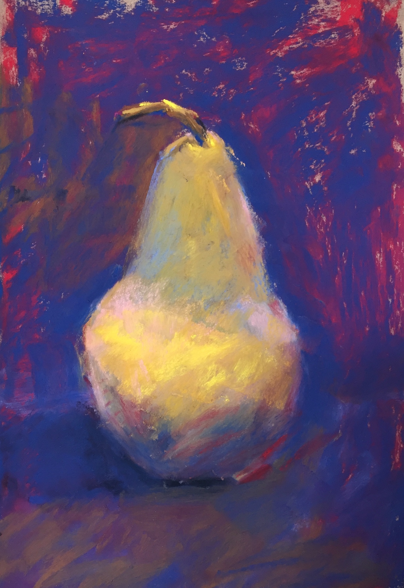
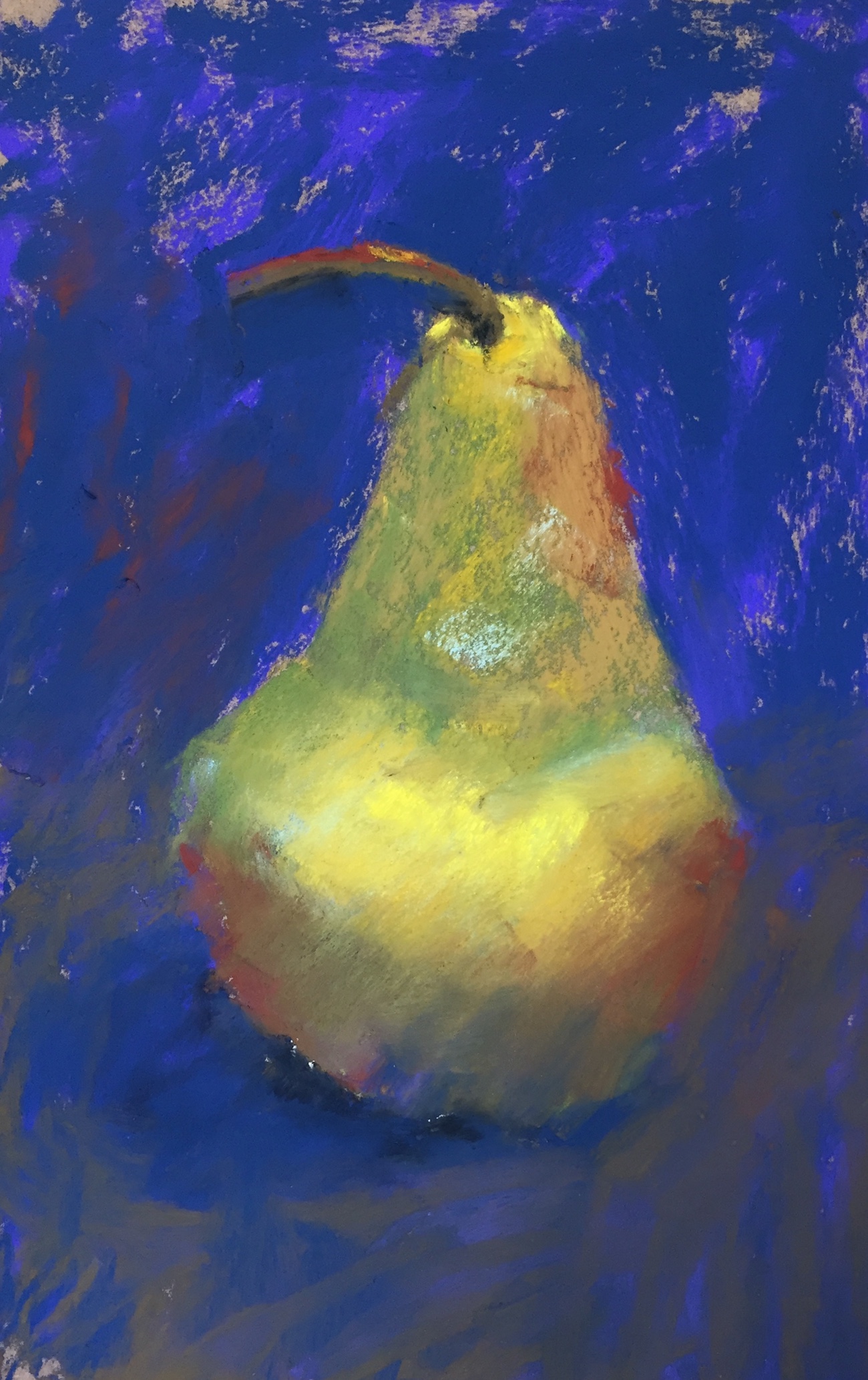
First I used three colours in three values referring to the local colour of the unripe Bosc pear. Then I created another example using three colours in three values but with colours that in no way resembled the local colour of the pear. I created a third version at home using the same method as the second with a different set of colours. Note too that my underpaintings are dry underpaintings, made solely with a lightly applied layer of pastel (i.e. no liquid involved!).
First, the three pieces with their initial layers:


When choosing the initial colours for Version 2 and 3, I looked for colours beyond what is evidently there. I find this easier to do when working from life but it’s still possible using photos. (For these demos, I was working from life.) For instance, in the second version, I could see the colours I used within the greenish browns. In the third version, I chose different colours that are, on the whole, cooler than the second piece’s red and pink.
I then added a second layer to versions 2 and 3 using the same colours that I used to create the first layer of version 1 (the local colour version).


I then worked on all three versions a bit more. This included the local colour version but I didn’t add too much extra colour to it as I wanted the look to be more in line with thinking ‘local colour’.


I worked on each a bit more. (These are fast-painted demos – about 20 mins each.) Here are the three versions complete.

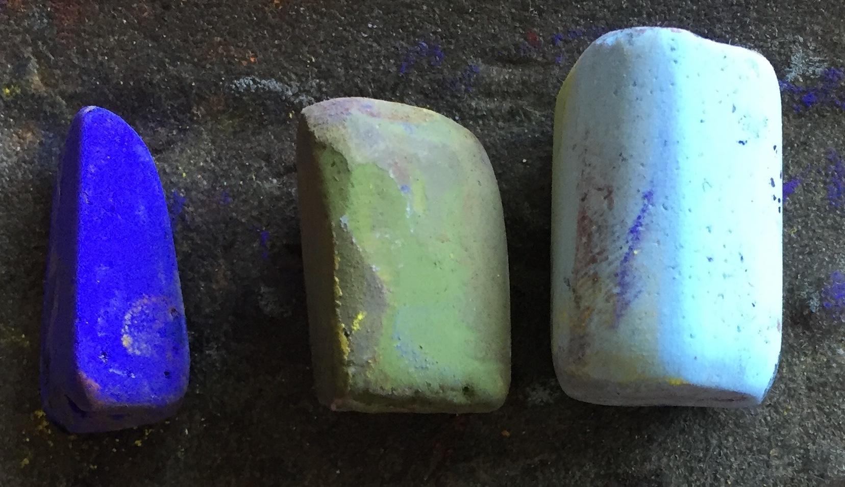
Here are the pastels used for each initial layer. The pastels used for versions 2 and 3 create a colourful underpainting. (All pastels are Mount Vision from the Workshop Set.)


Seen as thumbnails, the three versions look fairly similar and are pretty close representations of a pear. (We aren’t aiming for crazy colour here, just a more colourful rendering of life.)
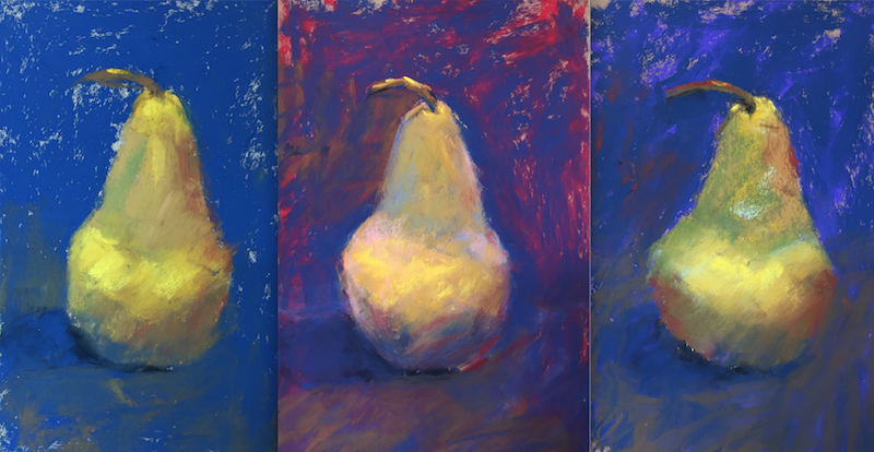
But look closer and you can see all the excitement of colour that lies beneath the layers in versions 2 and 3.

And just so it’s easier to compare, here are the three pears showing first layers only, and then the three finished pears.


So what do you think about doing a colourful underpainting? Do you create a colourful underpainting first?
I’d love to hear from you! Did you find this helpful? Can you see how a colourful underpainting can help make your work more colourful? It can also loosen up your need to paint something realistically.
Until next time!
~ Gail
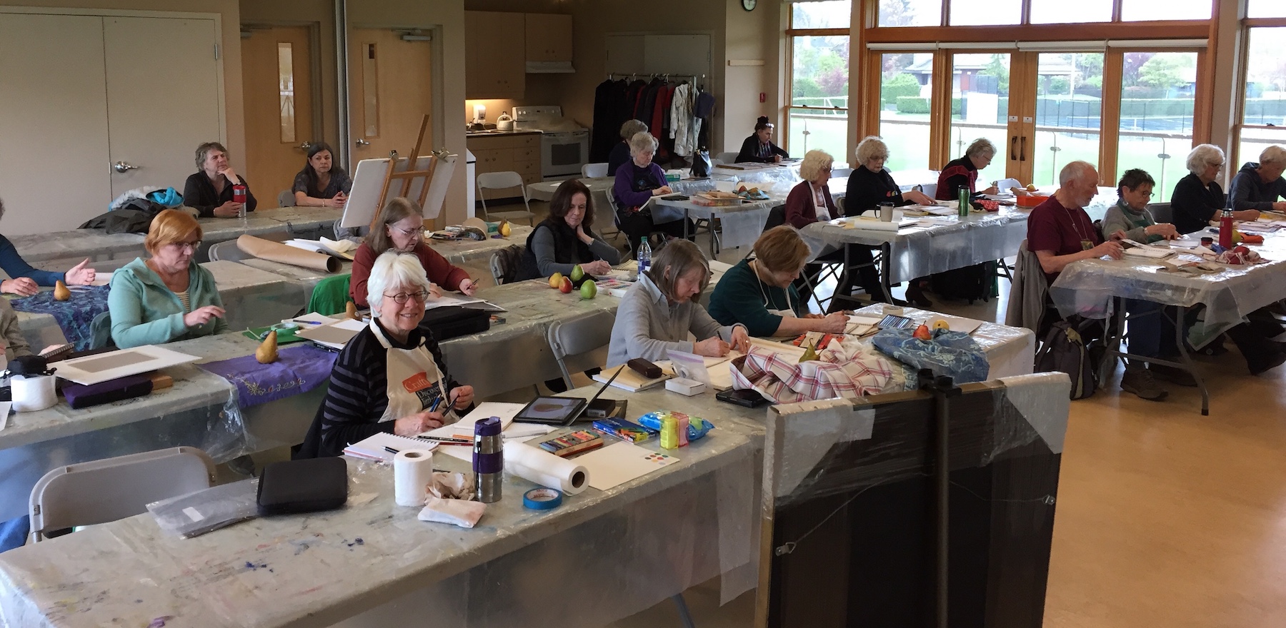
PS. Many of the students from the Windsor Park Art Club hard at work!
PPS. And here is the pear. I snapped the photo without care just before packing up so the angle is a little more above the pear than what I was seeing when painting. Notice that in my quick demos, I totally ignored the creases in the fabric.














24 thoughts on “A Colourful Underpainting Can Give Vibrancy And Interest To Your Work”
Very helpful. I need to do more of these quick sketches. I am a fan of using Dr. Ph Martin inks for the base colors but there is a drawback – they don’t mix with the subsequent layers. I’ll try doing a set of these and see how it works.
Glad to hear that Andrea. I love the way pastels ‘mix with each layer adding more complexity. Yes, do try it. Make them small, simple, and fast! That way you can try out all sorts of combinations!
Great demo of the effects of under painting showing through. Thanks.
Yay! Thanks Gisela. I’m glad it shows the difference.
Is that Windsor Park in Oak Bay?
Yes!! Evidently you know it Cathryn 🙂
I love this and how each just brims with color. I don’t know if I will be able to apply it to my own work yet.
Thanks Celeste! I love your words “brims with colour”! The thing is to have a light hand (light pressure) on those initial layers. The sanded paper does grab the pastel but leave the heavy pressure application until the end layers. Why not try some small experiments?
I used to teach to my high school students the use of vibrant color underpaintings. They always looked at me like I was crazy, but their ‘white’ teapots came out awesome! Your examples using the pear are a great visual for teaching this. I appreciate your clear explanation.
Thanks Susan! Love hearing about teaching your students about colourful underpainting,s and laugh to think of them looking at their crazy teacher 😀 I love using colour under white as you did with them. What a difference it can make!
This is a great demo Gail. I’m assuming these bright, non local underpainting colours can be used in landscapes too.
Thanks so much Helen. And a definite YES to answer your question!!
What a great reminder on how to use color layering.
Glad you think so Bernadette! Thanks!!
I’m trying to understand underpainting…get it….but I’m confused as to how to do it. I mean how do you decide what colors to use? Is it pick one? Theory? And so many ways…alcohol, water colors,,,,
I’ve not had any formal education in art or color and I consider myself a “street artist”. I just play until I get the results I think I want!
I hear you Char! First off, I tend to use a dry underpainting as described above. Mostly because I can’t be bothered to deal with liquids, drying time etc. Others do get great effects by these methods. I’ve just got into using dry pastels.
As to choosing the underpainting colours, you can try random for fun. I often look for an underlying colour OR just go for warm under cool and vice versa. A neat idea is to do small colour studies to try out different colours. Have a look at this blog I wrote: https://www.howtopastel.com/2017/02/creating-colour-studies/
And yay for playing!! Keep doing it 😀
As usual, a very helpful, precise and thorough demo, with a simple subject that does not deter the beginner: you’re the best!!
Many thanks.
Thanks so much Dom! I’m glad you see it as useful. And you are the best for saying so 🙂
Thanks Gail. Useful demo. I’m currently doing a commission on the theme eat drink and be merry, and you’ve helped crystalise the solution.
Aidan that’s truly wonderful to hear! Look forward to seeing your results.
One of the things that’s so cool about pastels is seeing that brilliance pop out from under. I remember when I was just getting started in pastels (about 12 yrs. ago), I saw a painting that used vibrant complimentary colors that optically blended and looked realistic from a distance….but as you got up closer, you could see all the brilliant marks that the painting was comprised of…..absolutely beautiful!
Truly love your blogs…..thank you, Gail
Yes yes YES Curtis!! You have described the possibilities of pastel so well. I too love when you get closer to a painting that reads fine from a distance and discovering all sorts of other colours popping through and also, as you say, the marks themselves. Soooo exciting!
And thanks for your kind words about my blogs – really appreciate it Curtis 😀
I love the effects of colorful underpaintings. It was fun seeing the differences between versions 2 and 3 – I have a slightly different system for choosing the colors for an underpainting, dividing warms and cools by group with cool shadows and warm lights – then build back to the regular tones. I’ll often do complementary underpainting too, where I’m just using chromatic opposite of the local color. But this is wonderful and when it’s random, what happens in the finish is a sense the light’s slightly tinted! Shifts the time of day or type of light. Version 2 looks painted at or right before sunset, maybe a particularly colorful dawn when the light’s coming at a very shallow angle and diffuse. Version 3 is just blazing with brighter sun from closer to midday – that’s how they read. I keep this in mind when planning landscapes more than still lifes. Still lifes could have any interior lighting or windows.
Thanks for adding to the underpainting conversation Robert. Love your descriptions of how the different versions appear to you.
I definitely had fun with these! And happily, they really show how an underpainting can change the end result.