I was on a deadline today – a post was due to be published! I wanted to show you a progression through one of my paintings. Problem was, I didn’t have anything to share. So I needed to get creative quickly. I set a timer and chose a limited palette by using a starter set. I decided on Terry Ludwig’s Best Loved Basics because I knew it contained a deep purple and I was going to need it since I’d be painting plums. Once I got started though I wondered how in the world it would be successful – I was missing colours I felt I needed!! But I didn’t have time to waffle about so I got stuck in and embraced the restriction of the limited palette. Have a look!
First the set up.

What I struggled with from the start was deciding the divisions of values – what would be light, what middle value, and what dark. Would the plums AND their cast shadows together be the darkest value? Or would I need to create shapes of middle value within the plums and also the shadows on the left (which in life looked lighter than the ones on the right)? Choices to be made. You can see my struggle in the thumbnail.

And then I got into the pastels.

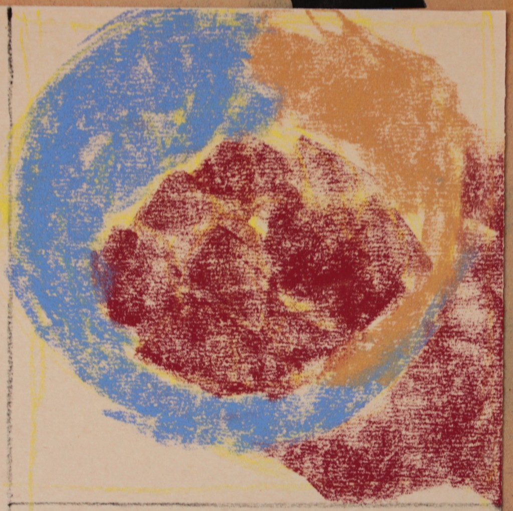


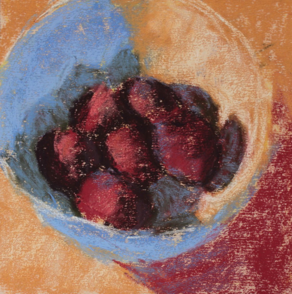

Gail Sibley, “Backyard Plums,” Terry Ludwig pastels on UArt 400 grit paper, 6 x 6 in
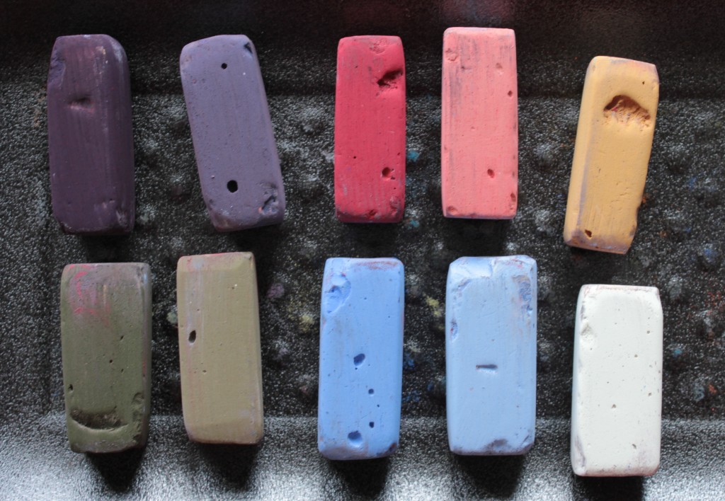
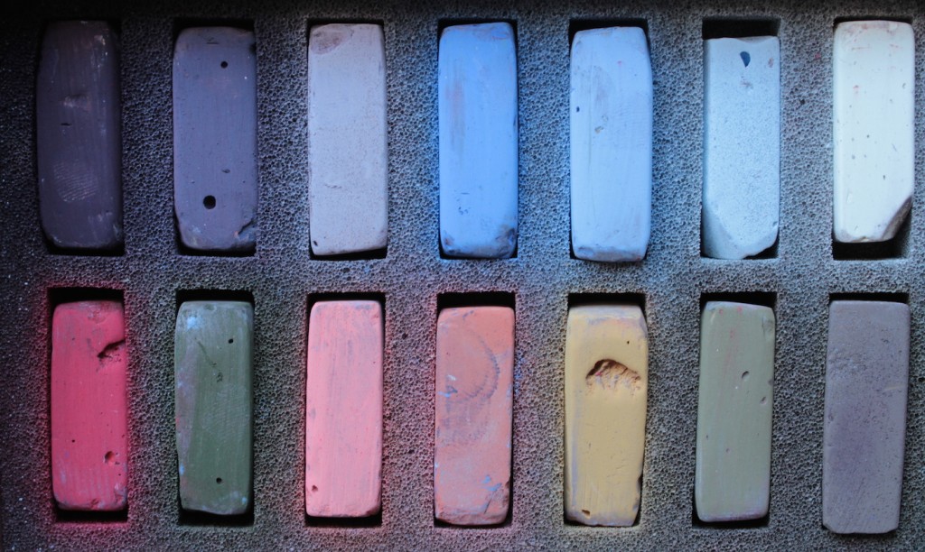
This was a huge challenge for me. First there was the restriction of time. I set the timer for half an hour, created the thumbnail and then drew up the piece on UArt paper. (The bowl of plums I had on hand pretty much as is.) I then reset the timer for 40 mins and finished the pastel before the timer went off. Whew!
So there was the demand of limited time. Then there was the limited palette. And it wasn’t a limited palette of carefully colours I selected. No, it was a limited palette taken from an existing set. Sometimes you just need to work with what you have. My challenge here was using colours I might not normally have chosen to paint this set up. I yearned for colours that weren’t there. I was outside my comfort zone for sure!!
~~~~
So tell me, have you ever used a set of colours that were outside of your comfort zone? And if you have, how did you feel and what was the result?
Thanks for being on this pastel journey with me.
Until next time,
~ Gail












14 thoughts on “Push Your Creativity with the Restriction of a Limited Palette”
Gail-
YES, I have worked with a “limited palette” outside of my comfort zone. I did the Terry Ludwig 30 Umber Set Challenge. It was TOUGH as you had to plan out values EARLY on so you did not work yourself into a corner. Suggesting “light” was very tough as the the set did not have any true lights. It was a GREAT learning experience.
Enjoy your work and postings,
Randall.
Hi Randall,
Oh the Umber challenge would have been quite something! Sounds like it forced you (and others) to work out a value plan at the start – a good idea 🙂 I am sure suggesting light would partly coming from juxtaposing a darker colour next to the ‘light’ one.
Thanks for sharing this. I have just started a HowToPastel subscribers group on Facebook: https://www.facebook.com/groups/howtopastel/ and I’d love if you showed your piece there commenting on this post.
Gail
Love it!!! it turned out beautifully! Just wonderful the way the yellows are in the blues and around the lid. Great job! Very enjoyable to see it develop.
Thanks so much Karyn!!! I sure was wondering part way through if I’d be able to pull it off! Glad you like it 🙂
Once, I accidentally brought only THREE pastels to a mixed-media workshop. The three were a chalky beige, cream, and a mauve-y beige. They happened to be lying in the bottom of my bag — I had totally forgotten that we were to bring pastels at all! Yuck, right? The pastel part of the project was one of the most enlightening pastel experimentations I’ve ever experienced! I saw the juxtaposition of very subtly differentiated colors turn into a sophisticated and delicious moment. All accidental, of course.
Catherine what a whale of a story! THREE????? And those colours! I would love to see what you came up with and why the great learning lesson. Out of bad comes good sometimes yeah? Thanks for sharing 🙂
Thank you so much for this. Very informative seeing the progression. Inspiring.
Glad it was helpful David. In the doing of it, I really wasn’t sure how it was going to turn out and was pleasantly surprised 🙂
Really excellent painting, Gail!!
Wow Casey, I appreciate your enthusiasm for it! Thank you 😀
Hi Gail,
I, too, did Terry’s Umber Challenge, and finished, I think, FOUR paintings! A VERY tough exercise, great learning experience for finding subtle values. If you like, I can share one or two of them on your new Facebook group, which I just joined.
I LOVE this painting, by the way. I did a similar one, with apples, for a “black, white, and one color” challenge. The bowl of apples I used were green, both bowl and apples. I chose a medium blueish-reddish (using Vianna Szabo’s favorite descriptive suffix: -ish!) pastel for my one color. Loved the result.
Barbara (Archer-Baldwin..my PSA name)
The umber challenge would have been difficult indeed. Good for you coming out with four paintings! Thanks for including the other challenge you did – amazing what we can create with restrictions!
Please do add the images to the How To Pastel Facebook group: https://www.facebook.com/groups/howtopastel/. I’d appreciate if you would explain what they were for and also your struggles, what you learnt, your feelings about doing it.
Thanks Barbara!
I am new to your work and your wonderful website. I enjoyed seeing how you painted the lovely plums using the Ludwig limited pastels. It is inspiring me to paint small, time myself and see what I can do!
Thank you for your insights they are so enlightening.
Arleen it thrills me to know I’ve inspired someone to try something. Let me know how you get on!!