You all know how much I love colour! I love using it, I love seeing it, I love the feeling it gives! And I think this month’s guest, Clarence Porter, loves colour as much as I do 🙂
I encountered Clarence’s work for the first time at the ICAN conference and exhibition in Aurora, Ontario, Canada back in 2016. There was a large horizontal painting of an expanse of land, sea, and sky. You couldn’t help but notice this painting full of glorious, rich colour. And so I began to follow this artist’s work. A couple years ago, I included his one of his pastels in a round-up blog. You can see and read about it here.
Recently, I’ve begun noticing Clarence’s work popping up all over social media. It was like a neon sign from the universe – get this artist on your blog!! Happily, when I asked, in spite of a heavy schedule, Clarence Porter said YES!
Don’t know his work? Here’s a teaser.

Before I hand the blog over to Clarence, here’s a wee bit about him.
Clarence Porter Bio
Clarence Porter PAC, MPAC, PSA worked in the Toronto advertising world as an art director/freelance illustrator, a career spanning 40 plus years. Moving to Hamilton Ontario, Clarence pursued working in soft pastels and after receiving an Honourable Mention in the 2006 Pastel Artist Canada Purely Pastels Exhibition, he never looked back.
Clarence’s work is represented by Earls Court Gallery in Hamilton Ontario. He instructs at the Dundas Valley School of Art and is an occasional instructor at the Aurora Cultural Centre and the Art Gallery of Hamilton. He is also a part-time instructor at the Sheridan College in the Visual and Creative Arts Department. You can learn more about Clarence and see more of his work by going to his website.
And now a big welcome to Clarence Porter!
~~~~
One of the first things I tell my college students and my workshop participants is that colours don’t matter if the values are right. However, colours do matter and I love bold ones – with the right values of course. When they are handled correctly, all the elements work seamlessly together. Just look at Henri Matisse’s “Odalisque in Red Shalvarah” or the many contemporary pastel painters that I call my pastel heroes.

It’s not original to say I love working with pastels because of their intensity of colours and their immediacy, but I do. With the range of colours I have at my disposal and the ease of application, I can convey not only colours but feelings, quickly. No mixing paint or waiting for paints to dry. I can set the mood for a painting simply with the choices of these amazing colour sticks – pastels.
And if I’m not happy with how the painting is working, I can take a cheap bristle brush and kneaded eraser, and remove the unresolved areas then layer over top of them with more colour. Pastels are very forgiving that way.

In my past life as an art director and freelance illustrator, I learned focus and discipline. I also learned a respect for the mediums I worked in, whether markers, inks, scratchboard, acrylics, or computer-generated art. I had just touched the surface with pastels in my earlier days but artist Tim Daniels gave me my official introduction into the possibilities of the medium. Tim knew bold colours as well as good design.
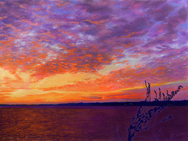
Why bold colours? I think my art reflects my life outlook and I think my use of bold colour palettes are my attempts at portraying the world in a brighter light. That’s my best guess.
I also see more than the brown bark of trees, the grey of shadows, or the green of leaves. I see the purples and blues in the tree bark, the oranges in the leaves and grass, the magentas and mauves in rusted metal, and the multitude of colours in the shadows. It’s all there. You just have to see it. Not look. See.
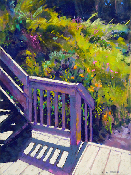
I find beauty in the contrast of the everyday. Whether it’s plumes of billowing smoke against steel factory stacks or long shadows racing across the ground, there is beauty to be found. Whether I’m walking through my neighbourhood, or climbing up to the hermitage atop a hill in the south of France, my inspirations are simple and everywhere.

Do I choose my colour palette beforehand? Up until my last series, “The Reaching”, I never preplanned my work: no thumbnails, grey scale, or colour studies. I just leaped right in and trusted my gut. There was no thought given to complementary versus split-complementary or triad versus tetrad colour schemes.
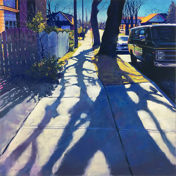
Before this last series, flying by the seat of my pants worked just fine for me. However, I had just acquired a rare 4’ x 15’ roll of Kitty Wallis Museum Grade Archival Sanded Paper and decided to use that for “The Reaching” series. Since I had never worked with Kitty Wallis papers before, the first challenge was to find out how it handled different wet underpainting methods and the layering of pastels. I turned to other pastel artists on Facebook and I also contacted Kitty Wallis directly and through the generosity of the pastel world, I was able to gather the information I needed to work with confidence on this new-to-me surface.
This was the beginning of a new process, of working with underpaintings and doing colour studies. With my photo reference in hand, I lightly sketched out the image directly onto the paper using a red number 311 Carbothello pastel pencil and then I came back over the pencil work, doing a tighter value study using a dark blue NuPastel – doing a kind of grisaille in blue.

After completing the same process for all of the images in the series, I fixed the blue underpainting and took pictures of it before moving to the next stage, the wet underpainting. Next I applied my “dirt” colours, as Karen Margulis calls them, using medium-soft pastels. I used SpectraFix as my liquid medium and did the wash on my dirt colours. I tested both alcohol and SpectraFix on the Kitty Wallis paper and decided I prefered how SpectraFix reacted as a wash medium.
I let them dry and moved on to the next stage – the colour studies. As I said, up until this point, I had never done colour studies for my pastels but one of the things that really connected with me at a Lana Ballot workshop was her mention of the importance of doing them. You always have to be ready to accept something new and though colour studies weren’t a new idea to me, hearing her explanation for doing them and looking at her examples made me see how this approach would be so beneficial for this project. The wonderful archival paper I had and my shadows concept demanded such attention.
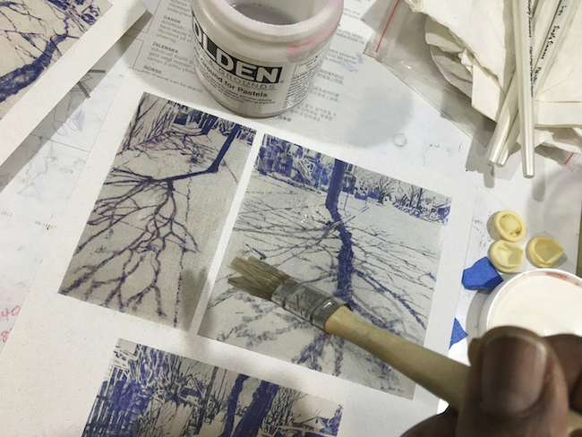
On card stock, I printed out 4-inch high colour photocopies of the photos I’d taken of the dark blue “grisailles.” I put a wash of thinned-out Golden Acrylic Ground for Pastels over the card stock to give myself a pastel paper surface and I began my small colour studies.
This is truly where I realized the importance of colour studies and how they eliminate a LOT of colour concerns when it came time to work on the actual paintings. They helped me use my pastels with even more confidence.
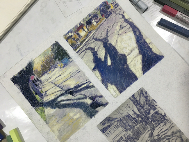

All of this initial prep work took time but the rewards came when I was in the end stages of applying the final hits of my Diane Townsend Soft Form No. 804 – which I’ve had forever and guard with my life.

My pastels of choice in a general order of use are: NuPastel sticks, Rembrandt or Faber-Castell soft pastels for doing my foundation work and then in combinations, Sennelier, Terry Ludwig, Diane Townsend, or Great American soft pastels for layering and finishing. For any tight detailed work I need to do, I use Derwent, Faber-Castell or CarbOthello Stabilo pastel pencils.
My pastel paper of choice is the UART 400 Premium Sanded Paper. It gives me the surface texture that lets me play the way I like playing with pastels. I would love to get my hands on more Kitty Wallis Museum Grade Archival Sanded Paper but I don’t think that’s going to happen again.
I’ve been called a colourist by some. I don’t know about that but I do like my colours!

“THE REACHING”
~ Clarence Porter
Saturday morning walks to the local convenience store
to pick up “The Spec” for Su.
Mid-March and the long morning shadows
appear to be reaching away from their naked trees.
There is a rhythm constantly of dichotomies:
dark and light, turmoil and calm, death and rebirth.
Eureka: shadows reaching for light.
Winter reaching for spring.
~~~~~
Oh my. Oh my oh my oh my! Look at all that delicious colour! Not only have I enjoyed Clarence sharing his work and progress, I’ve learned something! This idea of priming a printout of the start of your work with pastel ground over which to do colour studies is so cool!!
And what do you know, Clarence is a poet too 😀
And now, Clarence and I want to hear from YOU! What’s your biggest takeaway? What’s your fav painting? Do you have questions?? Let us know by leaving a comment 🙂
Until next time,
~ Gail














41 thoughts on “Clarence Porter – A Colourful Outlook On Life”
Clarence is one of my favorite local artists. I love his way of seeing my hometown. My first pastel course was with Clarence at AGH and I learned so much from him. Even now as my work demands so much these days and I’ve had less time for pastel, I follow Clarence and you’re right Gail! He seems to be everywhere, which is a testament to his work. Cheers Clarence! You colour my world! The Reaching series and the steelVIEWS are special favorites.
Louise, thanks for sharing your connection with Clarence. And I love your compliment to him – “You colour my world” – wonderful!!
The trees project would seem to lend itself to abstraction, I’m wondering if Clarence has worked in abstract, or have you, Gail? (I think I’ve seen some of your work that looks semi-abstract now I come to think of it, maybe abstracted reality!)
I agree with you Jan, trees (and their cast shadows!) do lend themselves to abstraction.
To answer your question about whether I have worked abstractly, the answer is certainly yes! I think I may have remembered to apply the “abstraction” tag to particular blogs. You might do a search and see what turns up 😀
Sorry, the form flew away before I was finished. I meant to say, beautiful work and thanks for sharing your process. I struggle with chromophobia in my own work, but love the way you use colour, very uplifting in these strange times.
Hah hah. Jan I had thought of combining your comments but I loved the way you expressed the submission – oops – and so left it. And anyway, this is a bit of a different topic 🙂
These images are sooo (as Gail would say!) absolutely captivating. I really appreciate when artists share their long-studied and developed techniques, and also can’t wait to try the pastel ground on card prints for color studies. I was really curious about “Diane Townsend Soft Form #804” and looked all over her website, thinking it must be a highlight color…Imagine my surprise to see the actual color! (Won’t give it away…!) Thanks for a great article.
Therese, isn’t that colour the most LUSCIOUS YUMMY colour?! You can see shots of it when you look closely at Clarence’s work. (And I won’t give it away either!)
I looked it up after your “teasers”!! I can’t believe it; I only own a handful of Diane townsends and I own this one. Funny thing is I’ve never known what to do with it! Guess I’ll be studying Mr Porter’s artwork even more now!!! I think he is absolutely genius. Shadows and houses and industrial and flowers with shadows . . . Happy Sigh .
. .
Happy sigh indeed!! 😁
Can’t wait to hear what you do with that colour!!
What a treat to wake up to this article on a grey wet morning in Wales – my day is now full of light and colour, thank you Clarence and Gail.
There are certain artists that delight in their dynamic compositions and consistent brilliance – Clarence is certainly one of them in my book!
Oh Gareth! And your comments lift me on our grey day here on the Canadian west coast! And I’m sure Clarence will be warmed by your lovely comment too!!
These are stunning paintings. I love the shadow pictures and find “Out the back door” and “The colours between” really appealing. In less expert hands they could have been completely uninteresting.
You are so right Eddie about the two paintings you mention. And many wouldn’t even see a reason to paint them!
Thank you Gail for this highly interesting post and thank you Clarence Porter for the insights into your working process. I love colour too and absolutely adore these wonderful paintings, especially “When Fall comes”. I think there is a difficulty with bold colours, a small line between “amazing” and “it looks like a childrens’ drawing” – I’m still struggling to pass that line onto Clarence’ side! 😜
Thanks Gabriela! I love that you shared this idea around using bold colour, that there’s a line between creating WOW work and work that has other’s thinking, hmmmm, my child could do that. We all want to be on the WOW Clarence side of creating!
I have admired Clarence Porter’s work since I discovered him on Insta a few years ago. I share his love of color, just seeing it and not being afraid of it, and of the Diane Townsend fluroescents, which I use a lot. I am still at the point where I rarely do a color study (despite knowing the benefits), but his idea of printing out the grisaille underpainting, putting down a ground, and doing it on top of that is so brilliant that I am going to try it and have a feeling it may convert me to being more methodical in my painting. I would be interested to hear more about how/when he uses pastel pencils—I resist, even though I own some, preferring my NuPastels and thinking of them as too drawing-y—but maybe he can convert me to that as well. Thanks for this!
Thanks Jane for your comment and question! I think I need to get some of those DT fluorescents! Glad Clarence’s process of printing out the grisaille underpainting and working over it for the colour studies has inspired you! Let us know if you did indeed try it!!
And I’ll leave Clarence to asnwer your question….
I met Clarence at the Lana Ballot workshop. Such a wonderful gentle soul. My wife and I both truly admire his work. When we first saw “The Reaching” we were both gob-smacked. Truly amazing work. Thanks for sharing.
A gentle sould indeed! And yes, gob-smacked is an excellent description of what one feels when first encountering Clarence’s Reaching series!!
Thank you, Gail, for your outstanding post “Clarence Porter – A Colourful Outlook On Life”. It is full of new ideas and fresh inspiration. I appreciate what you continue to contribute to our pastel community.
Thanks so much Mark! I’m delighted to hear Clarence’s post inspires you. And I do wonder how these new ideas will be reveal themselves in your own work 🙂
Really interesting story of an Artists journey. Some great tips also. Thanks Gail and Clarence.
Glad you enjoyed it Glenys and got some good tips too 😀
Clarence is truly a masterful pastelist and colourist. As alway, his work is so emotionally engaging and inspiring. Great post!!
Thanks Jessica!! Love that you brought up the way Clarence’s work not only engages our senses but our emotions too!
Clarence is and has been one of my favorites for quite some time…..BECAUSE of his use of color. I was attracted to pastels for that very reason…..AND because of his subject material. I love houses and architecture and his inclusion of vehicles in his work. His street scenes are remarkable….!! And, as much as I love impressionism, his crispness and attention to detail really hit home with me…..his work, his attention to perspective is spot on….and THEN there’s all that color.
Thank you, Gail, for having him as your guest…..and thank you, Clarence, for your inspiration….
Hey Curt, thanks for your colourful comment and so much great attention to what’s going on in Clarence’s work!! So much good stuff. And it made me smile and nod my head in agreement.
Clarence Porter’s post is outstanding! This was my first exposure to Clarence Porter’s art, and his paintings are gorgeous; I immediately became a fan! I am so appreciative for the detailed information Clarence provided on his process, and on his listing and description of materials; it is most generous of him to share this with us. I feel inspired and educated – a wonderful combination! Thank you, Gail and Clarence!
Ohhhh wow fabulous to be discovering Clarence Porter’s work for the first time! It’s always a treat for me to know I’ve introduced a reader to a new-to-them artist 🙂 Thanks for your apprecaition of Clarence’s work and his generous sharing Sharron!
I love Clarence Porter’s pastel’s, I just had a pastel accepted into the Pastel Artists of Canada on line juried exhibition.
Awesome Rae!!
And congratulations!!
(I forgot to enter… 🙁 )
Pingback: Bits and Clips for November 2020 – Polly Castor
The “sunset and shadow things” blew my boat out of the water! That mackerel sky! the lone piece of growth in that contrasting color in the foreground. My first introduction of this stunning artist and his varied works and style but most of all COLOR!!!! Thank you Gail, as usual I’m late to the party but better late than never! And this warmed me on a howling nasty NE day!
Oh oh OH Brenda!! I’m smiling from ear to ear from your comment!! I am delighted to have introduced the work of Clarence Porter to you 😀 Glad it’s warmed you on a horrid winter day.
I love Clarence’s tree shadows and my favorites of these paintings are Reaching #6, the Sunset and the Out the Back door.
What a terrific take-away: the copying of a photo of your value study, coating it and then trying out different colour schemes! Genius! Thank you, Clarence, so much. Carol from East Preston, Nova Scotia
Thanks Carol for sharing your favs. Those tree shadow paintings (the “Reaching” series) are pretty stunning!
And YES! that take-away is brilliant.
Hi Gail, Thank you a gazillion times for your blog and especially for Clarence’s contribution.
You are sooooo welcome!! A gazillion thanks can definitely keep me going 😀
I met Clarence probably 30 years ago. I remember when he met his now wife Susan, who I worked with at a graphic design studio. He was as charming as he was talented. I have followed his work since and I love his use of colour.
Hey Diane, thanks for sharing your own personal connection with Clarence. It must be so interesting to have followed his artistic development over the years!