I just finished teaching a five-day plein air workshop at MISSA (Metchosin International Summer School of Arts). I had amazing students who painted diligently every day. One of their challenges was painting summer greens! Snuggled into a corner of the Pacific Northwest, the location of this art retreat is top heavy with trees both evergreen and deciduous, all coloured in an assortment of summer greens.
How do I deal with summer greens? I paint in layers. I first lay down the big shapes I’ve determined in my thumbnail: three values (light, middle, dark) in three colours. When painting summer greens, I like to underlay them with warm or cool violets and sometimes colours from the orange side of the colour wheel.
I had students do some practice work, trying various purples and oranges under whatever greens they had in their palettes. Often the greens in starter sets can be fairly high chroma and too unreal for use in a landscape painting just as they are. So layering greens over violets and oranges will transform the greens into something more easily workable in the green summer landscape. The main thing to remember is to layer colours of the same values.
Let me take you through my demo first. I wanted to show a scene of greens and how to deal with it, colour-wise, value-wise, and simplifying-wise.


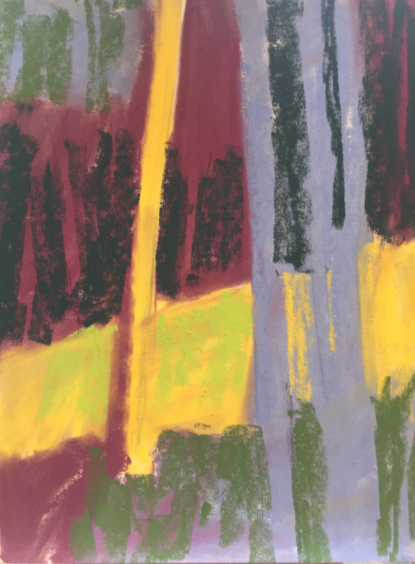
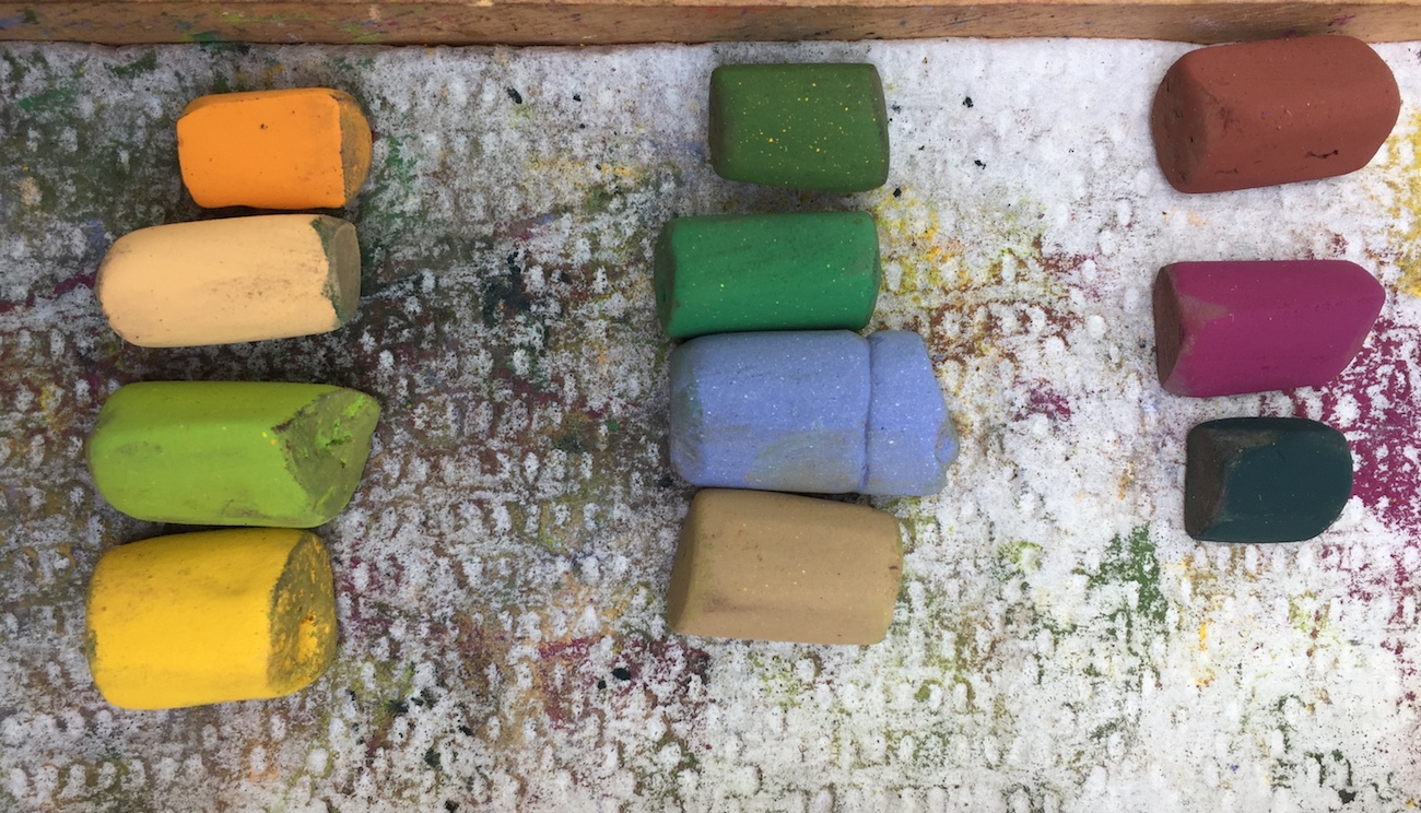
Here are the three colours used for underpainting:


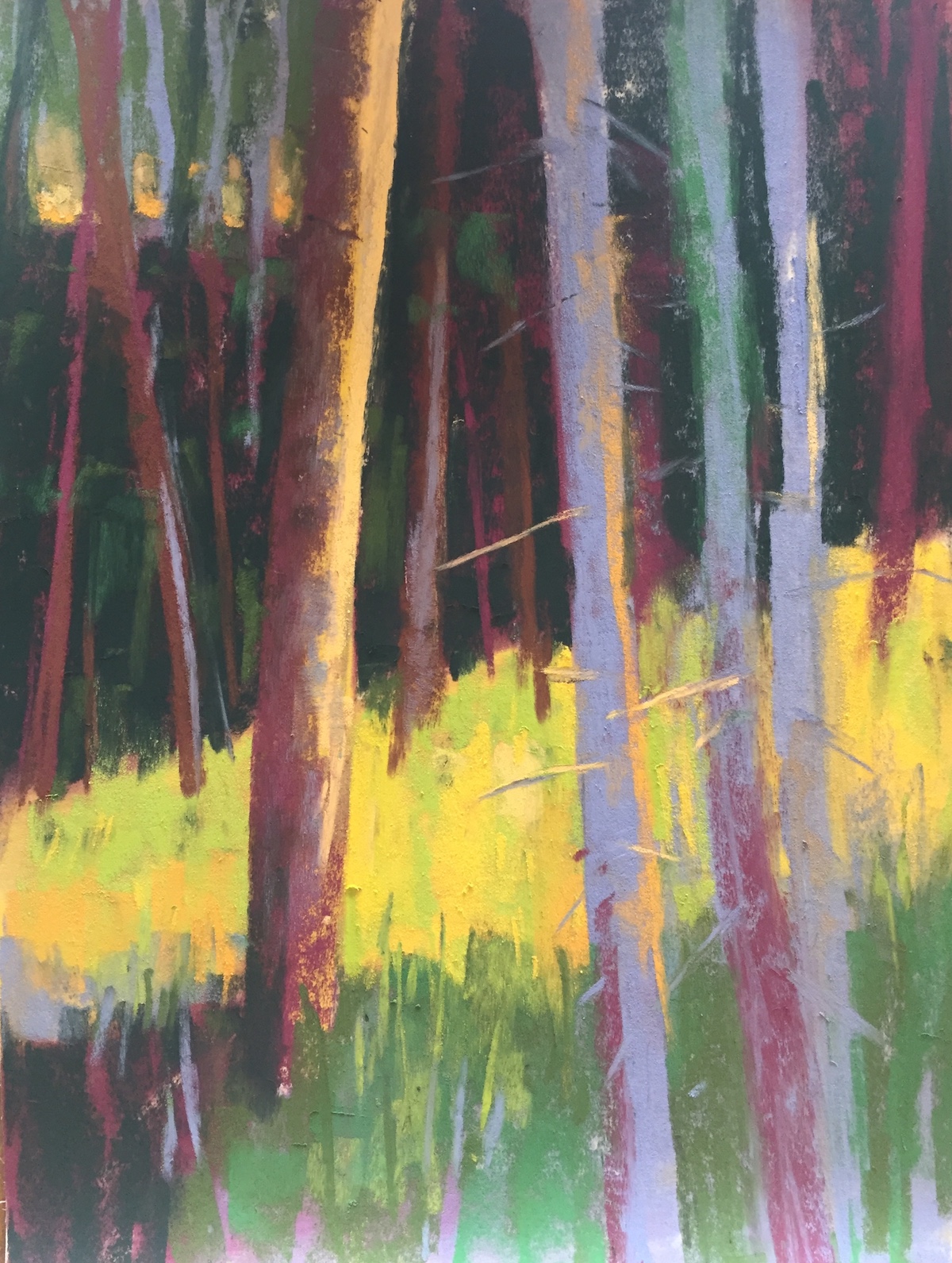
Back in the studio, I made a few tweaks. And here it is finished…

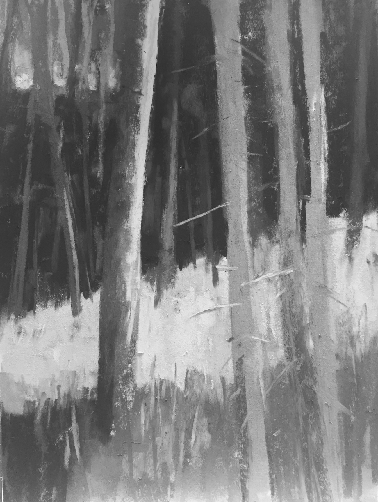
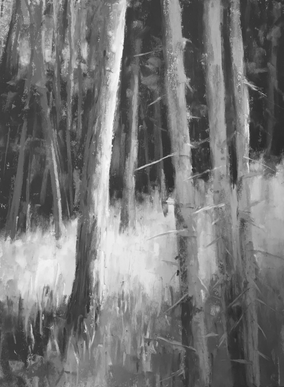
And in black and white…
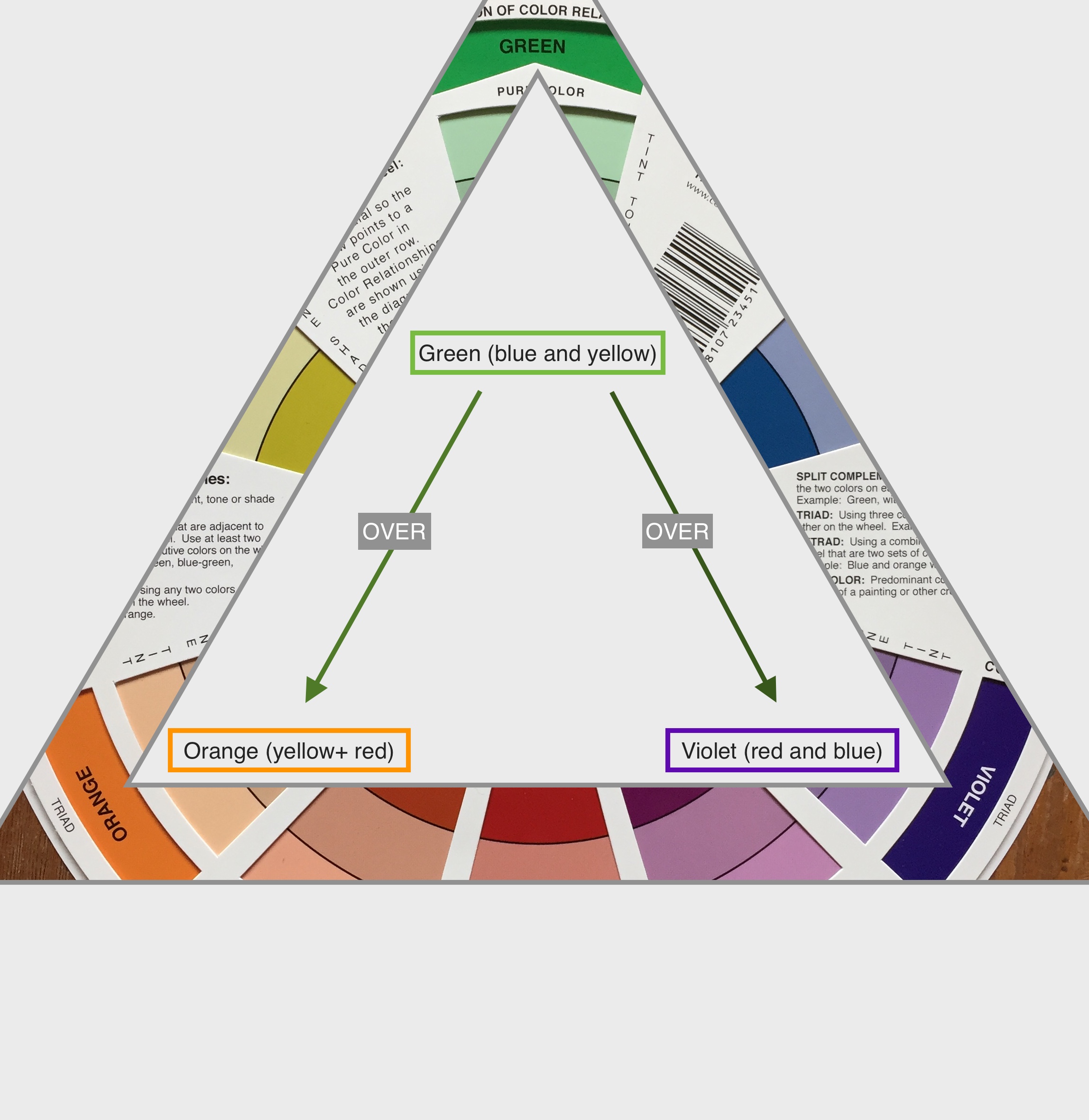
Let’s look at a wee bit of theory. Greens, oranges, and violets form a triad on the colour wheel. Have a look below:
When we use the three primary colours together, we always create some form of grey. If we use two secondaries together, we are doing the same thing since each secondary is made up of two primaries. So in fact, when we overlay a green over a violet or an orange, we’re creating a form of grey.
However, in pastel layering (as opposed to say oils or acrylics), we don’t crush the pigments together so each colour still has a voice and speaks to us through the layers.
Also, since each pastel is created from uneven amounts of the primary colours, when we layer, we won’t get a perfect grey (thankfully!). Rather we see a colour that is muted and leans slightly (or moderately) towards grey but retains some of the flavour of each of the original colours.
Let’s look at these base colours with greens over them.
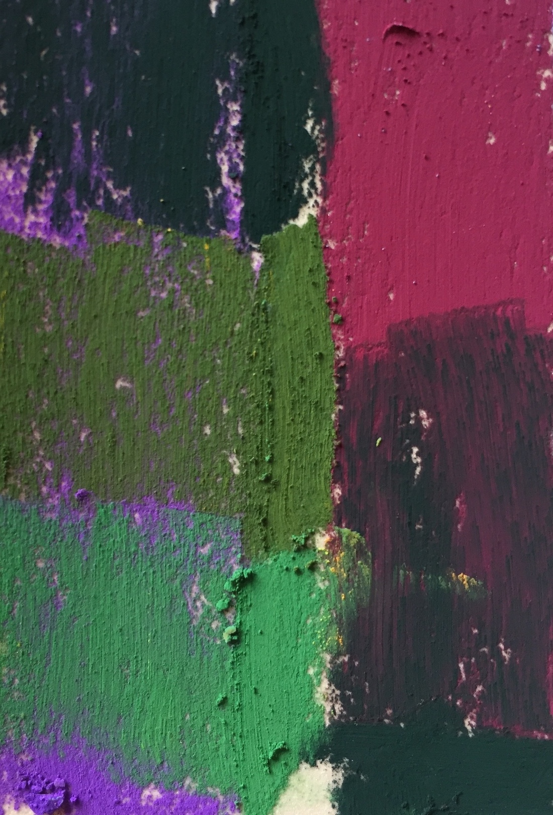

I had students do this exercise so they could see themselves, the change in the greens, and also so they could explore the possibilities of various greens over violets and oranges as a way to deal with painting summer greens.
As I was writing this blog, I remembered that Albert Handell had talked about the challenge of painting summer greens in the IAPS interview I made in 2017. Here it is:
I know that Richard McKinley also talks about using purples and oranges with greens to make them look more natural in the landscape. I found this article by him on the subject.
And that’s it for me! Please let me know if this was helpful information about painting summer greens or if you have questions. Just leave a comment below. I LOVE hearing from you!!
Until next time,
~ Gail
PS. One of my MISSA students snapped me while I was teaching…..

Here’s the colour wheel I use in combo with value finder:













30 thoughts on “Painting Summer Greens In Soft Pastels”
Thank you so much. Gail. You have done an amazing job of explaining how to deal with greens in the landscape (something I have struggled with). And you have presented it so simply that I will actually remember what to do!!
Audrey Dulmes (wish I was able to take the workshop)
You are so welcome Audrey!
And that you will remember what I said? That’s the best thing I could hear 🙂
Thank you for sharing your knowledge!
I’m glad you find the information useful Lillian 😀
Loved this topic as I do paint a lot of green landscape here in the Southeast. Will definitely use this info on my next project.
That’s great to hear Maryann. Summer is such a glorious time but it sure can be trying to paint its green clothing!
Very useful and timely post. Living in the well-named Green Mountain state, summer can feel like we’re swimming in a gigantic ocean of greens. It’s overwhelming and discouraging at times. I like how you combined the theory with the demo. Both so helpful.
I know so much what you mean! Sometimes it’s easier to zoom in on an area (as I did) rather than trying to catch it all.
Glad you found this post helpful 🙂
Thank you Gail. I’m new to pastel and never know how to start the underpaint, what colors to use. Especially where greens are concerned! This article was very enlightening.
Thanks once again.
Yay Mirian! Glad you’ve started using pastels 🙂
What I might suggest with regard to choosing colours to underpaint with, do a couple of small (say 6 x 8 in) pieces of the same subject but with different colours below. You will see a difference for sure. And this will also help with your confidence level using colour.
Great advice! I’ll try it. Thanks once again.
Thanks Mirian. Let us know how it goes!
Thank you Gail for an interesting lesson on greens. I have just done a piece of Big Bend rocks and grasses on brown paper, it is so drab. I am going to try your suggestions to using these under paintings to produce greens. Big Bend is very brown with lots of colors in the rocks and gray green in the undergrowth, I want to make it more vibrant. I am going to do the small samples of different underpaintings to produce different colors. I am transitioning from detailed pastel portraits to loose abstracts, but keep getting stuck in detail.Thank you again for all the instructions. Is there any chance of you coming to Austin Texas for a class. ? Lakeway Art and New Braunfels Art galleries are in this area and spring would be wonderful for all the bluebonnets and spring greens [smile]
Ann, thanks for sharing your local painting experience. Remember to think value. Once you get this concept, you can play with all sorts of colours and make them ‘work’ visually. Then think warm under cool and cool under warm. This can add tremendous visual excitement under greens AND browns. Also, take time to observe. You’ll find blues, and purples, and pinks and oranges in rocks that essentially look grey or brown at first glance.
Love knowing this post was helpful you!
I would love to teach a class in Austin, Texas. Is there a local group there that would invite me to teach?
I always enjoy receiving your art news in my email. I appreciate your focus on values (very important) and your step-by-step process.
And regarding greens…there’s just SOMETHING in the green color range unequal in any other range. The soothing quality of our natural canopy, I guess.
Thanks for acknowledging! And keep up the good work! – Lisa
Yay – love hearing that you enjoy receiving my posts Lisa!!
Yes, values are a huge part of what I teach. Of course there are other aspects but I think values are the most difficult to see and grasp and put into action.
And yes to the quiet and calm of our green environment!!
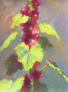
Thank you so much for this helpful information, Gail. I like that you show the pastels you were using for the painting. Actually I’m still working on my hollyhocks with your help from your previous post! And I ordered some more pastels from England (Unison and Blue Earth). ☺
Your references to other artists are appreciated too. Look forward to your next post! Pastel painting is wonderful!!!
So glad to hear you liked the post Gabriela. Love that you are working on the hollyhocks via my last blog post 🙂
And DELIGHTED you ordered more pastels, particularly Unison. (I haven’t yet had an opportunity to try Blue Earth!)
I agree – pastel painting really is wonderful!!!
Thank you!!!!
You are soooo welcome Marlene!!
WOW; an excellent article about painting greens. I especially liked the inclusion of the Albert Handell video and the Richard McKinley article. That really gave it a well-rounded lesson. I will refer my students to this also.
Marcia thank you for your enthusiastic response to the article!! I love adding other resources when I can and Albert Handell and Richard McKinley are leading proponents in this idea of using purples and oranges with greens so it was only fitting to point to them.
Thank you for sharing this post!
Hi Gail
Thank you for the subject of greens. I particularly enjoyed Albert Handell video comments . His description of how he saw summer greens was so palpable as to using warm and cool mauves and enjoys painting with them since he got his insight, it seemed from his observation as the sun changes. It made want to jump outside anywhere there’s a nice Plein air landscape with summer greens and try to see what he does.
There is so much more to color and we are always learning.
Great to hear Sandi! And yes, I know what you mean about Albert Handell’s words about greens. I hope you did jump outside and try a plein air full of greens 🙂
And yes, colour is a never-ending subject!!
A very timely re-post before the color workshop in Gibsons. Thanks so much, Gail. I think I got more from this article this time around than I did originally. Sometimes it takes awhile for information to sink in, and it doesn’t hurt that I’m living surrounded by greens in Courtenay for a few weeks and thinking hard about my favorite view from a bridge on our morning walks. Will try to finish one version before the beginning of the workshop.
I agree Jean, we often aren’t ready or even capable of absorbing everything all at once and sometimes we need the space of time to allow us to have small ‘ahas’ along our art journey.
Look forward to seeing you at the Gibsons workshop and looking at what you’ve done while in Courtenay!
Very interesting, thank you Gail. I’d heard of the purple and orange theory before, but I hadn’t heard it explained in terms of different tones before. I’m going to try your exercises when I get round to it. I always thought the solution was to buy more and more green pastels!
I hope you do try the exercises Anne. Just take a piece of paper and play around with different swatches. Try to keep the values as similar as you can i.e. lights over lights, middle values over middle, darks over darks.
And there’s nothing wrong with adding a few more greens in different values, temperatures, and intensities to the mix!! Just know they can be helped by using a different colour underneath 🙂
This is the first art lesson I’ve done of yours and I am so impressed! Not only by your lesson, but that you included two other great artists and their thoughts on greens. Between the three of you, I got it! I have always liked purple with green and now I know why! Thanks again!
Hah!! Carol, I got goosebumps reading your comment. Breakthroughs like this are gamechangers for your art!! And that makes me HAPPY!!