Wow, it’s been a busy few months teaching and travelling so my monthly top ten choices have been on the back burner. But I’m back with some juicy pastels for you!
Before we get to those pastel choices, I’ve been asked how I make these choices and where I find images. So here’s the deal. I have my eyes open for juicy pastels, pieces that strike me – usually on Facebook or Instagram though sometimes I come across the website of an artist whose work appeals to me. I don’t solicit submissions. Rather, I prowl the internet! And then I create a collection of images over the month (or two in this case) and as I prepare for the blog post, I go through them again and again, making choices.
These choices get more difficult when I’m down to about 20 images. Then I start thinking about what I can say about each piece. I also try to include at least two or more genres and different styles but it really depends on the pieces I’ve collected. Soon I have about 12-15 pieces and I begin looking, analyzing, and writing. It’s in this final process where the final ten paintings emerge to be published. It’s an involved process that takes a lot of time!
And now, here are the juicy pastels for this month!
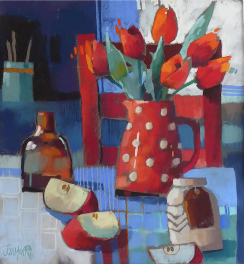
I feel happy when I look at this painting of everyday things arranged in an almost haphazard way as if not arranged at all. Yet there is a clear path the artist has prepared for us to take around the painting. Objects overlap which leads us from one item to the next. The chair is overlapped by the jug which also covers the stems of the tulips that sprout out of its mouth. The jug is overlapped by a jar which in turn is partially blocked by an apple slice. The edge of the paper cuts off the apple slice and we are bounced back toward the diagonal line of overlapping apple slices that ends at a dark bottle that sits against a dark background. From there we leap through the darkness, still on the diagonal course, to a turquoise canister from which spring thin long shapes. These forms echo the verticality of the chair and also the frame of a window. All of which visually brings us back to the tulips. Overlapping shapes, repeated forms, and visual contrasts in value and colour help move our eyes around the painting. On the second run through, there’s time to explore and enjoy the details of colour, line, and shape.
Jan Munro paints recognizable objects yet they aren’t rendered in a realistic way; they don’t sit within a conventional linear perspective. Rather, they are flattened and become shapes that take up a certain space on the paper. The even spacing of the grids on the tablecloth also revoke any sense of perspective. Even with the rigidity of vertical and horizontal lines throughout the painting, there’s a feeling of movement – from the push-pull of warm and cool colours, the tilting of various objects, the aforementioned diagonal lines, and very much so, from the staccato lines that flicker around the flowers.
Along with the combined pastel application of smooth and linear marks and her limited colour palette, Munro’s use of negative space as an equal partner to the objects remind the viewer that this piece is as much about the process of painting as it is about the content.
See more of Munro’s work on her website.

Here’s another still life arrangement that’s exactly the same size and format as the one above. But how different it looks and feels! Here the artist also uses a limited palette time but this time the colours are a muted arrangement of violets, warm browns, and creamy whites punctuated by a few greens and blues. The purples are intense but in their darkness, they appear subdued in amongst the more neutral and less intense colours around them.
Unlike the other piece, we are aware of a feeling that this is a well thought out arrangement. We have the sense of each shape, whether subject itself or space behind, being carefully considered and adjusted. This focus on the pattern of the pieces that make up the painting is exaggerated by the dark outline surrounding many of these shapes. This attention to shape (rather than subject) confounds the apparent realism of the piece with its impression of perspective and volume of the objects. This play between verisimilitude and flat design is also revealed in the background where we perceive the three-dimensionality of city high rises but also feel the group of them sitting right on the paper’s surface almost part of a tapestry design.
Part of the composition is created by the pattern of dark and light especially seen if we squint. Look at the counter with its grid pattern of mostly dark runner against the white table. The painting is built up of instances of dark against light (for example the irises and vase against the light of the window) and light against dark (the lime slices on the deep purple fabric and the lantern against the curtain).
This is a quiet meditative piece with the only movement breaking the stillness being created by the ‘X’ of diagonal lines across the piece from corner to corner.
Check out more of Ann Wilkinson’s work on her website.
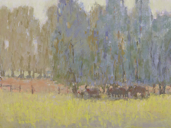
Far from the delineated and hard-edged shapes of the previous painting, this one by Carol Strock Wasson has large shapes with undefined soft contours. The painting brings to mind the tonalists with its close value range and quiet, muted colours. Half close your eyes and you still see the arrangements of colour areas but notice that there’s no high contrast of dark darks and light lights. Indeed, the colours don’t stray far from mid-value yet even then there’s still a sense of light, middle, and dark areas within the middle value range. From this limited value choice comes a sense of unity that resists the distraction of variety and detail.
This painting does have a narrative but its appeal starts with colour, shape, and pastel application. The large minimal shapes are filled with strokes of broken colour within a close colour and value range. The broad areas of trees are split between blues and light browns while the two horizontal strips consist of a peachy-orange in the background one and lime green scrubbed in for the foreground. The light sky that bumps its way across the top looks to be a mixture of strokes in pale mauve and greens.
It’s quiet except for the buzzing of the crickets in the mounting heat. Cows crowd under the shade of the dense blue trees, in the coolest part of the painting. Shapes of cows are also seen beneath the distant trees trying to find relief from the heat. There is little activity. The artist doesn’t focus on details but rather paints a picture of a feeling of what it’s like to be in this field on a sweltering day. The brightness of the foreground makes us shut our eyes against the strong light while the trees give us respite from the unmitigated and oppressive temperatures.
Click here to see more of Carol Strock Wasson’s work.
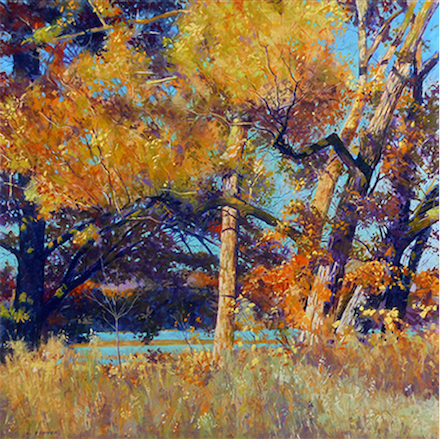
Contrary to Carol’s painting, Clarence Porter’s painting explodes off the paper. The square shape seems barely able to contain the eruption of saturated colour. Dense purples of deep shade and the shadow side of the tree trunks contrast with the rest of the scene ablaze with yellows and oranges. The turquoise sky that peekaboos from behind the trees and is reflected in the strips of water beyond the woodland juicily supports the firey colours and lightens the dark areas.
Our attention is taken immediately to those bold yellow leafy shapes that project outward at us and that break the picture’s frame on the left. The tree trunks that support these branches lean away towards the right. The projecting branch holds the tree trunks in place, keeping them contained within the boundaries of the painting. Porter takes the chaos of tree trunks, strongly lit and twisting around each other, and makes us see the sense of them by selectively including and not including for the painting while at the same time giving us a sense of the turmoil that would have been there at the actual scene. We keep looking and probing in and around – in the sunlit and the shady areas – and discover nuances and accents of colour and thin branches unseen at first glance.
The field in front is kept simple and although filled with colour and texture, all sit within the same value and so don’t grab our attention away from the stars of the show beyond. They support and add context to the view. The horizontal strips of water behind add some calm to the confusion and tell us that we are by a river somewhere on a warm fall day. The sun shines and all is well in this part of the world.
See more of Porter’s work here.

This painting portrays perfection and smoothness, where all is wonderful. Everything has a slightly softened outline – there are no hard lines to mar the serenity of this vision. Everything sits in its place perfectly. The water is smooth, the grass is cut, no unruly weeds show, the paths are clear, the buildings are unblemished, no tree leaf seems out of place. The light is warm in the late afternoon. An idyllic scene complete with windmill.
This looks as if it’s a real place caught at a time of day with no one around. Reflections fill the scene – the windmill, the trees, the other building, the sky. And yet in this paradise, something feels not quite right. There’s something unsettling about the stillness and about the absence of people. What is the artist saying? How do we read the painting? Certainly, the reflections of the title could also refer to an inner contemplation, an opportunity to do some self-reflecting in this meditative silence. The absence of people gives us that opportunity as we’re not distracted by a narrative.
This mainly green picture underlines the introspective nature of the piece – cool green water, trees of warm sunlit green and dark shaded greens, warm swaths of lime green lawn. The greens are broken up by the pinks of a flowering tree in the distance (behind the windmill) and the orange of a tiled roof of the wee building on the other side. There’s also the blue of the pool-like area on the right. The white of the windmill and various paved edges and the pale cool blue of the sky also lighten the heavier overall green colour.
I couldn’t find a website for George Tsakiris but you can see his work on his Facebook profile.
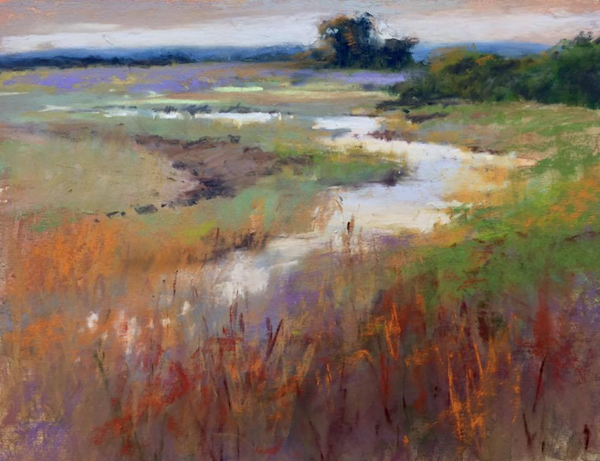
I love the dreamy colour of this poetic landscape by Willo Balfrey. It also shows that perfect time of day when all is revealed in the crystal clear air of the morning. The scene is a simple one: a water zigzags its way through the landscape, disappearing in the distance, land on both sides and sky above the horizon. A few bushes and a small stand of trees, as well as the grasses in front, offer some vertical notes to the piece. This minimal scene is an excuse to revel in pastel strokes and glorious colours!
The composition of dark trees on the horizon pulls us in. Below is a gorgeous shade of mauve, a line that starts us on our journey down the ribbon of light reflecting off the water. This moves us through the landscape down to the vertical slashes of orange against a darkish foreground that then pushes us back into the scene, over to the sparkles of water seen through the grasses on the far left. We swoop up the curve of a swale towards the dark horizon.
What really caught my attention in this piece was the brush-like effect of the pastel. Look at the strokes near the bottom right. They look like brush strokes of oil paint scumbled over the surface. I was also caught by the colour combinations – saturation and low intensity, warm and cool, dark and light.
I love the glow of this elegant impressionistic landscape, the feeling of meditative quiet. I could sit here forever looking out on this scene.
Look for more of Balfrey’s work on her website.

Pow! This painting, even on the small size of a computer screen (or tablet or smartphone), demands your attention. But look at the measurements – it’s actually a huge painting. Imagine how it must bowl over the viewer in real life!
Jimmy Wright is daring with the composition; the chin of the model sits almost on the edge of the painting while the subject’s hair takes up almost half of it. Yet it’s the volume of the hair and its attachment to the top edge that keep us and the subject planted firmly in the frame. Although the hair takes up quite a bit of space it’s not filled with any sort of detail. It’s a large shape of vigorous scribbles and erasures over a smoother area of colour. We have the sense of how this hair feels and acts rather than an accurate interpretation of it. Through pastel stroke – pressure, direction, speed – Wright gives us what we need to know. It visually illustrates the artist’s delight in the action of pastelling.
There’s also very little depiction of the face. Blue colour gives us the sense of facial hair while orange marks, judiciously placed, give us mouth, nose, ear, and the flesh that surrounds the eyes. All these sit against a pale white canvas of face. You can see in the drawing, Wright’s utter confidence and ability. Like Manet in his painting of George Moore, Wright sets the features perfectly within the face with very little rendering. Look at those barely described piercing black eyes gazing out at us, one slightly obscured by a pastel stroke. It’s just now that we see the faintest outline of spectacles added over top.
This is a portrait of Tom but what does it also reveal about the artist? I would love to have been able to watch Wright at work – was it done all at once in a frenzy or was it produced in fits and starts with many ponderings in between? It’s difficult to tell from the painting except by one’s own assumptions.
See more of Jimmy Wright’s work here.
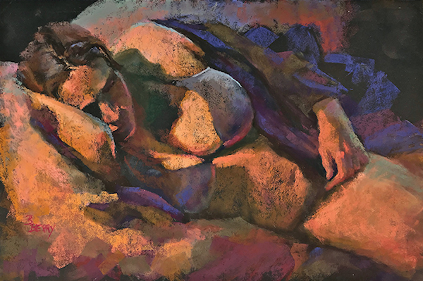
When I first saw this painting, for the first few seconds I couldn’t figure out what I was looking at. Then suddenly all the shapes and colours resolved themselves into a partially clothed reclining woman. I love that this painting has as its subject both a figure (once discovered) and also the aspects of painting itself – shape, value, colour, temperature, edge. Look to the bottom left where you can more easily see pastel strokes on the paper. Here the illusion of space in the painting is negated. You’ll find the same type of abstracted broad strokes within the subject but in these situations, if one pulls back, all coalesce into the arrangement of a figure.
The artist applies warm oranges and blue violets on black paper. This is so effective as the parts of the figure that are illuminated by the light source glow outward while places where black paper remains visible sink back into the darkness. The painting is made up primarily of darks and lights with middle values found only in the bra and parts of the sofa.
The pull of gravity on the body is evident – her breasts slump towards the couch and tug against the constriction of her bra. We feel the heaviness of a figure given over to the unconsciousness of sleep. The partially dressed figure, as well as the warm colours, suggest stifling heat. Her hand rests unheeded where it has fallen. Her face is in shadow except where the light catches forehead, the protruding nose, and her upper lip. There are some lovely subtle depictions of reflected light – on the far side of her face, on the under part of her bra, at the base of her chin.
Check out Barbara Berry’s juicy pastels on her website.
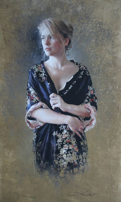
A beautiful young woman, bathed in soft light, grasps her fine dressing gown closed. She looks out, away from us. Both behaviours plus her creased brow suggest all is not well in her world. She may have the looks, the exquisitely smooth skin, the silky robe, but that doesn’t protect her from the vagaries of life. What can the cause of her unhappiness be? There’s no background information to give us context. It’s all left to our imagination.
She looks out at the morning light, hair uncombed and carelessly gathered up in a bun. Her dressing gown appears hurridly donned which leaves the line of her neck and the creaminess of her skin visible. One has the sense of her just rising from bed. Where is she? What is she thinking about? Is she alone or is there someone else in the room with her? Does her unhappiness stem from her loneliness or is she unhappy in a relationship? Or is she thinking about problems at work, or a friend in need? The story possibilities are endless. So by a simple gesture, a small furrow in the brow, a gaze that doesn’t include us the viewer, and a background with no hint of place, the artist has involved us far beyond our admiration of her technique to render this figure.
And her technique is to be admired! Look at the sensitive way Nathalie Picoulet renders the smoothness of skin, the texture of satiny fabric, the perspective of the hand, the solidity of facial features. The figure emerges from the background, fully formed except, as our eyes move to the lower areas, at the edge between background and fabric. The edge dissolves and the colour of the background becomes the colour of the floral design. This is a gentle reminder that for all the meticulous depiction of the figure (and for sure she is actually there!), this is still only an illusion of three-dimensionality on a two-dimensional surface.
See more of Nathalie Picoulet’s work on her website.

You can’t miss this almost monochromatic painting – there’s so much red! Then move beyond the red and be wowed by that face. The painter, Parag Borse, portrays it superbly. Look at the way he captures the fleshiness of the nose highlighted in the blazing overhead sun, the unshaven jaw with sparse bits of white stubble that speak to the age of this man, the squint and gaze of the eyes, the bright pink colour applied to the forehead wrinkled as it is by age and sun exposure. Then notice the folds of the turban as they circle away from his face. And finally, discover that much of the turban is untouched paper. The red of the headdress carries on into the background, moving into a place of abstraction where colour and marks become the theme. I’m intrigued by the contrast between illusion and disillusion in this painting.
I was fascinated that Borse would give this exquisite portrait such a small portion of the painting. With so much background given to the glory of red, there must be a reason for it. Red can mean so many things, for instance, power, blood and violence, passion. What does it represent for this man? What does it represent for the painter? And what does it represent to the viewer? This face presents a life of experience and perhaps difficulty. There’s a weight in the visual size of the turban that adds to the psychological effect of the painting.
I also need to point out that this painting looks as if it’s done on Canson Mi-Teintes. Whenever I encounter work so confidently rendered on this surface, I feel the need to bring attention to it. Borse also uses the paper successfully as part of the painting, not only in the turban where he uses the paper to read as headwear but also in less noticeable areas where it subtly acts as light or dark – on the cheeks, the neck, and parts of his shirt.
See more of Borse’s work here.
And that’s it for this month’s juicy pastels. Do you like them? Are you inspired by them? Are you perhaps puzzled by them? Or do you dislike some of my choices?
In all cases, I’d love to hear from you! So please leave a comment about these juicy pastels!
Until next time,
~ Gail
PS. Want some help or feedback on a piece? Why not get a video critique from me? As well as pointing out its strengths, I’ll give suggestions on where things may be improved. You can find out more here.










28 thoughts on “Juicy Pastels For June and July”
Just wow. I remember seeing Red Tulips and being charmed by it. Then, Hazy Summer Days is perfect for the smoky skies too common now from fires. I have to take more time to study all these. Thanks.
I like wow Marsha!
I know what you mean about Hazy Summer Days – a smoke filtered world it seems in so many places. Even here in Victoria, the air is affected by fires many many miles away. Another reminder that we are all connected!!
What an amazing variety of styles, illustrating perfectly the versatility of pastels. Thanks for sharing these.
You are so welcome Linda! I just LOVE seeing what people can do with pastels! It’s pretty remarkable isn’t it??
The unapologetic stare and shock of wild hair in the portrait of Tom by Jimmy Wright speaks to me in the same way Egon Schiele’s work does. Jimmy Wright has portrayed Tom in the same way he boldly paints his own self portraits. I’m a fan of Jimmy’s work he is a true original.
Borse’s Work kept me wondering if the look is one of strength or need or possibly both. The color, the placement of the head, the bare paper, the intimacy all work together to make this a very strong statement. The web site we’re taken to is unfortunately under construction.
Thank you Gail for some wonderful choices to study and carefully consider.
Gailen, funny that you should mention Egon Schiele! Originally I referenced him and also Klimt but realized my text was getting waaaaay too long (a tendency I seem to have!) so I am delighted that you have brought up the comparison! And yes, I too am a huge fan of Jimmy Wright’s work!
Love your reading of Borse’s work – thanks for adding to the story. Strange about his website. It was fine when I was researching but as you say, it now says ‘under construction’. Hopefully it will be back up soon.
Glad you enjoyed the choices Gailen!!
Thank you for sharing these artists and their works as well as your insights and observations! I didn’t realize how involved the process was in determining the selections….thank you for all of your time and effort! I truly appreciate your dedication and look forward to and enjoy your monthly reviews!
Thank you so much for your enthusiastic appreciation Ann!! Yes, these round-up posts take hours to put together especially in the writing. Often I get notes down about what I want to say (and that takes time in itself) but sometimes getting the language to flow, to construct sentences, sometimes it’s not as easy as I’d like it. In fact, it’s a bit torturous! Argh. So then I wait a day and then something clicks and off I go. And then there’s editing what I thought made sense but doesn’t quite. So yes, a long process! But still…I love sharing these pieces and helping everyone to look more deeply and consider WHY they may like a painting.
Happy Birthday, dear Gail! Today I’ve had lots of traffic on my website and after some investigation I realized you’d included my pastel in your “Juicy Pastels for June and July”. Thank you so very much!!!
It’s such a boost, and I’m just darned grateful you recognize the things I included in the painting. I love your blog and now have finally made myself sit down and respond to it. Thanks for getting us all to look much closer and appreciate the huge variety of styles and expression in the art of pastel painting.
Thanks for commenting Barbara. And you are so welcome. And I’m delighted that you are having more traffic to your website as a result of the post! I really was captivated by that piece of yours!
Thank you for sharing these beautiful pieces! They are amazing and each one is unique with it’s own intent and style.
Gosh you are welcome Karen! So happy to know the paintings have amazed you. Done my job 🙂
I enjoyed reading and viewing and re-reading and viewing these wonderful pastels. Two of my favorites were “Red Tulips” and “Sun Rising”. The narrative describing the paintings gives me inspiration in this journey of making better pastel works. Thank you for sharing this!
Thanks Carole! Love that you have been re-reading too. That makes me HAPPY! And what else makes me happy is that you have been inspired in your own pastel journey by the narrative!!
Jings ! I’m captivated by this blog. Such a diverse selection. I always love your choices & critiques and never know what to write in reply. Just know that you have opened my mind and blown it simultaneously 😆.
Well Lindsay, it was worth the wait for you to finally comment that I have opened and blown your mind!! Yehaw!!
Wow wow wow! I tried to pick out favorites, but I was blown away by so many. I went to each website and was happy to see so much more variety for each artist. Love your narratives too! Borse’s website said “under construction” so I couldn’t see more of his :(. Took me a while, but many times, this is so much better than watching TV!!
Thanks Gail!!
Hah hah! Ruth I’m tickled that you couldn’t pick out any favs AND that you think this is better than watching TV 😀
Thanks for taking the time to visit all the artists’ websites.
Yes, as explained above, Borse’s website was working before. Hopefully it will be up and running again soon!
Brilliant choices Gail. They are a wonderful advertisement for the breathtaking versatility of pastel.
Thanks so much Aidan!! It’s quite incredible what can be done with pastels isn’t it?!
The 10 are all great ones! And thank you so much for all the effort you put into these. I thoroughly enjoy them!!
Glad you like them all Cindy!
And thanks 🙂
Its incredible what attention you pay to so many beautiful works. I think I become a better artist with the observations you so carefully make. Thank you.
Anne that’s soooooo lovely to hear!! Thank you for your comment. It makes me feel all warm inside. 😀
Hello Gail,
I saw Willo Balfrey, “Morning on the Canal,” pastel, 9 x 12in. and was reminded of a painting I did this past fall in the 31 Day Challenge. Here is a link to it.
I learn so very much from your blog. Thank you for all the work you put into it.
Harriett
Thanks Harriett for your comment and your kind words 🙂
They say ‘when the student is ready, the teacher appears’. That applies to me, today, and your blog. This student was ready! I read your critique of each piece … slowly… and chewed on each word. Brilliant insights and so genuinely, personally, presented. You reminded me to really EXAMINE paintings to not just enjoy but to learn and to discover what totally works in each piece and what might distract. Your blog is such a huge fountain of inspiration. Thanks!
Tom, hugging you for such a lovely response to this roundup post. I’m glad it came at the just the right time for you. And I’m happy it reminds you to look closely, to understand what’s going on below the obvious content. Keep painting your lovely pieces!